CAD
CAD
 USD
USD
 EUR
EUR
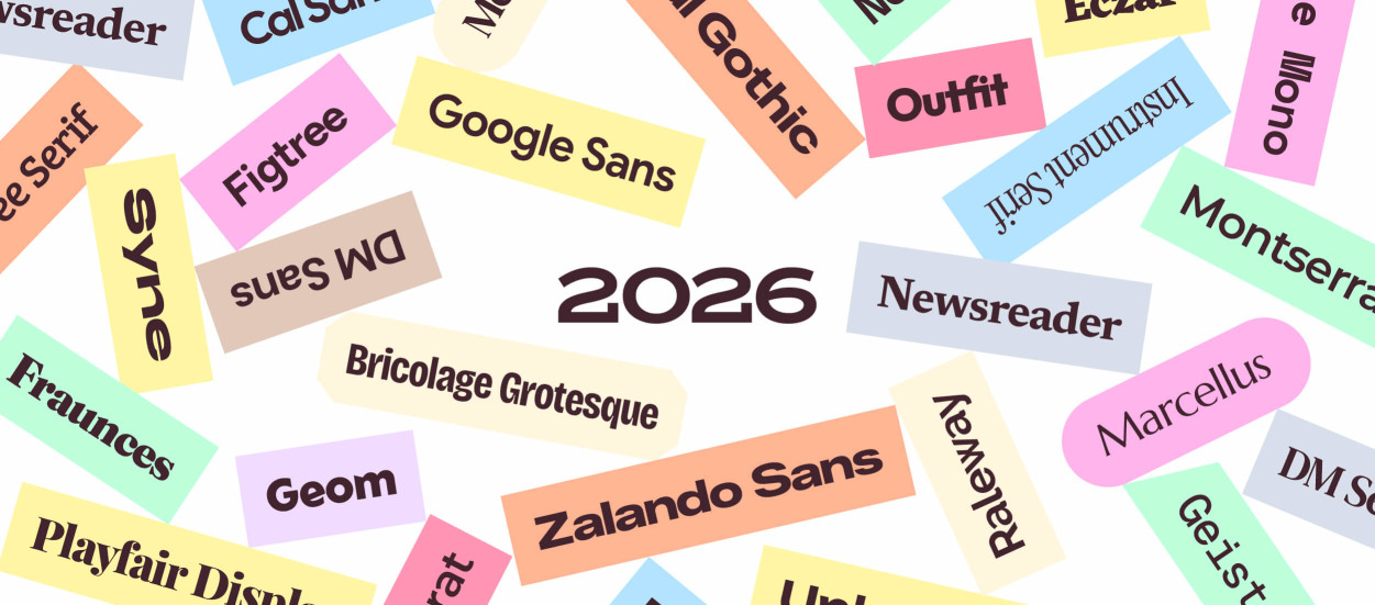


Choosing a font can make or break a project. It sounds dramatic, but it's true. Just imagine if the New York City subway system had decided to use Comic Sans instead of Helvetica for its signage.
Luckily, Google offers plenty of free, open-source fonts that designers and developers can use on websites, graphics, and more. We've curated the best 50 free Google Fonts here so you can find just what you need. And once you spot a favorite, downloading a Google Font takes about a minute.
How to choose a Google Font
There are a lot of choices, so it’s easy to feel overwhelmed. Here are a few things worth asking yourself before you scroll:
- What's the tone of your project? Warm or clinical, playful or authoritative, or timeless or right-now? Each of the fonts below has a different vibe.
- Where are you using the font? A font that looks good on a billboard can fall apart at 14px on mobile.
- Do you want a font with range? If you'll be using the font in both headline and body copy, it should look good in both places. And if you'd rather combine two typefaces, our font pairing library shows combinations that already work.
- Do you prefer serif or sans serif? Sans serif is more modern and minimalist, so it's better for digital designs. Serif is more traditional and looks better in print. Can't decide? Pairing a sans serif with a serif gives you both.
Answering these questions can help you decide on a winner, but if you need more help, check out our typography rules for Google Fonts for more guidelines to consider.
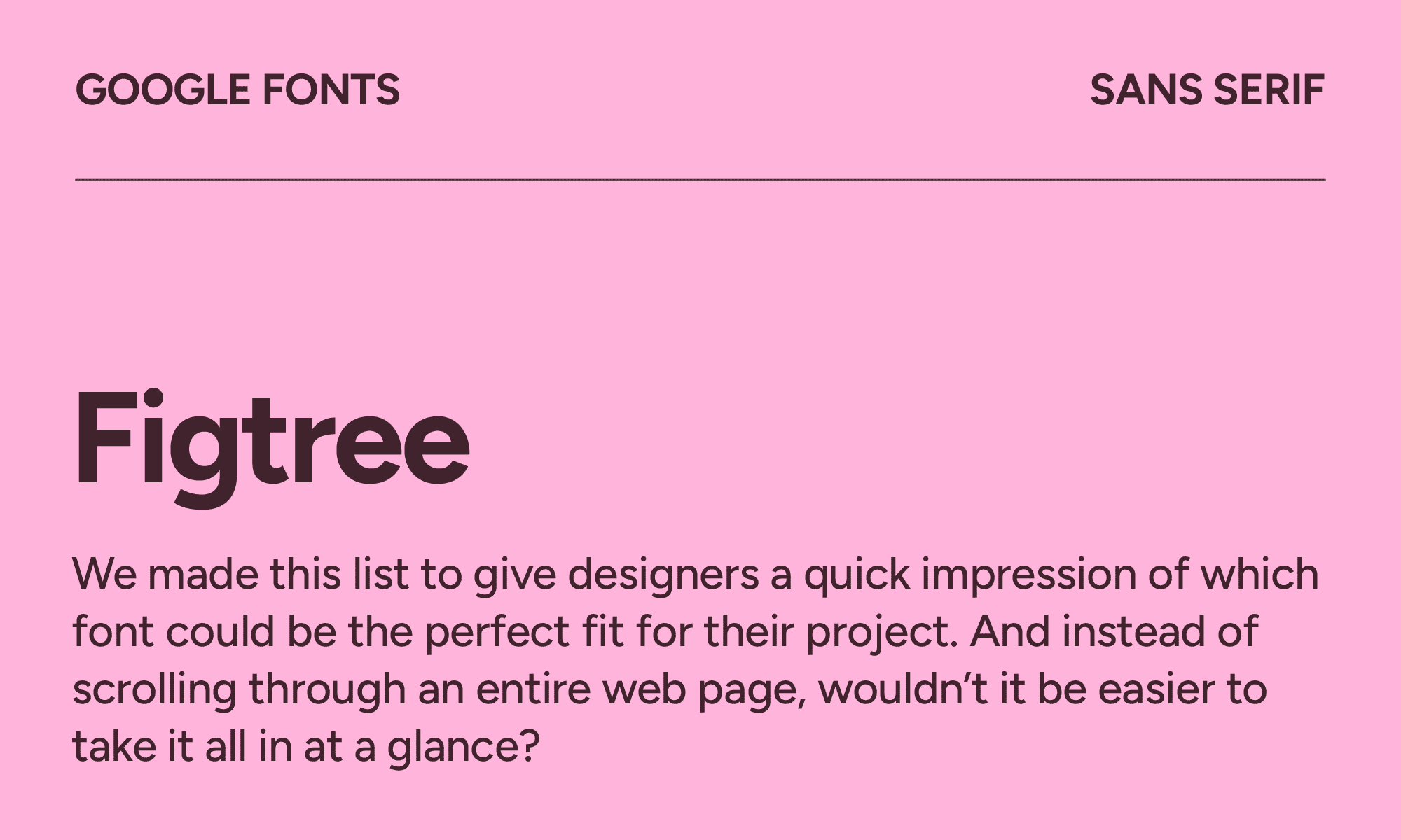
Figtree
| Classification | Sans serif |
|---|---|
| Designer | Erik Kennedy |
| Styles | 14 |
| Link | Download Figtree |
Figtree is an excellent font for SaaS product interfaces, app landing pages, and startup websites because it’s easy to read, even at small sizes. It’d work great in pricing tables or feature breakdowns without making the reader feel like they need to put on their glasses.
It’s one of the best UI fonts released in recent years. If you’re already using fonts like Inter and want a replacement, Figtree does the same job with a little more warmth.
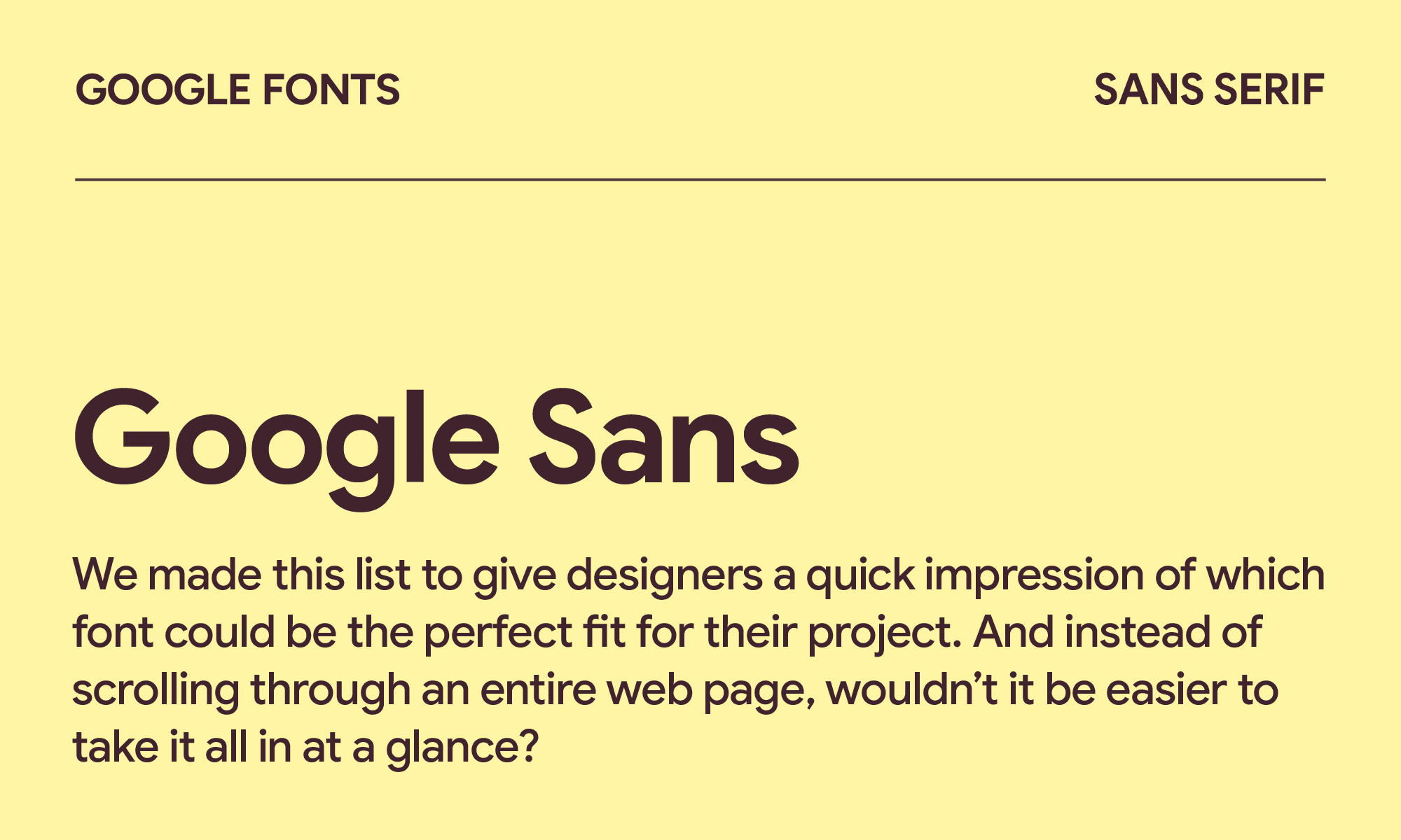
Google Sans
| Classification | Sans serif |
|---|---|
| Designer | |
| Styles | 8 |
| Link | Google Sans on Google Fonts |
With its clean sans-serif look, Google Sans is another font that’s great for digital products. You’ll recognize it as the font Google uses for its brand typeface, so using it in a project will automatically add an air of legitimacy. However, it might feel like you’re always slightly in Google's shadow. It would work in a fintech or health app that wants to be seen with authority.
Google Sans is a good replacement for a font like Nunito Sans, especially if you’re looking for a crispness that's more recognizable.
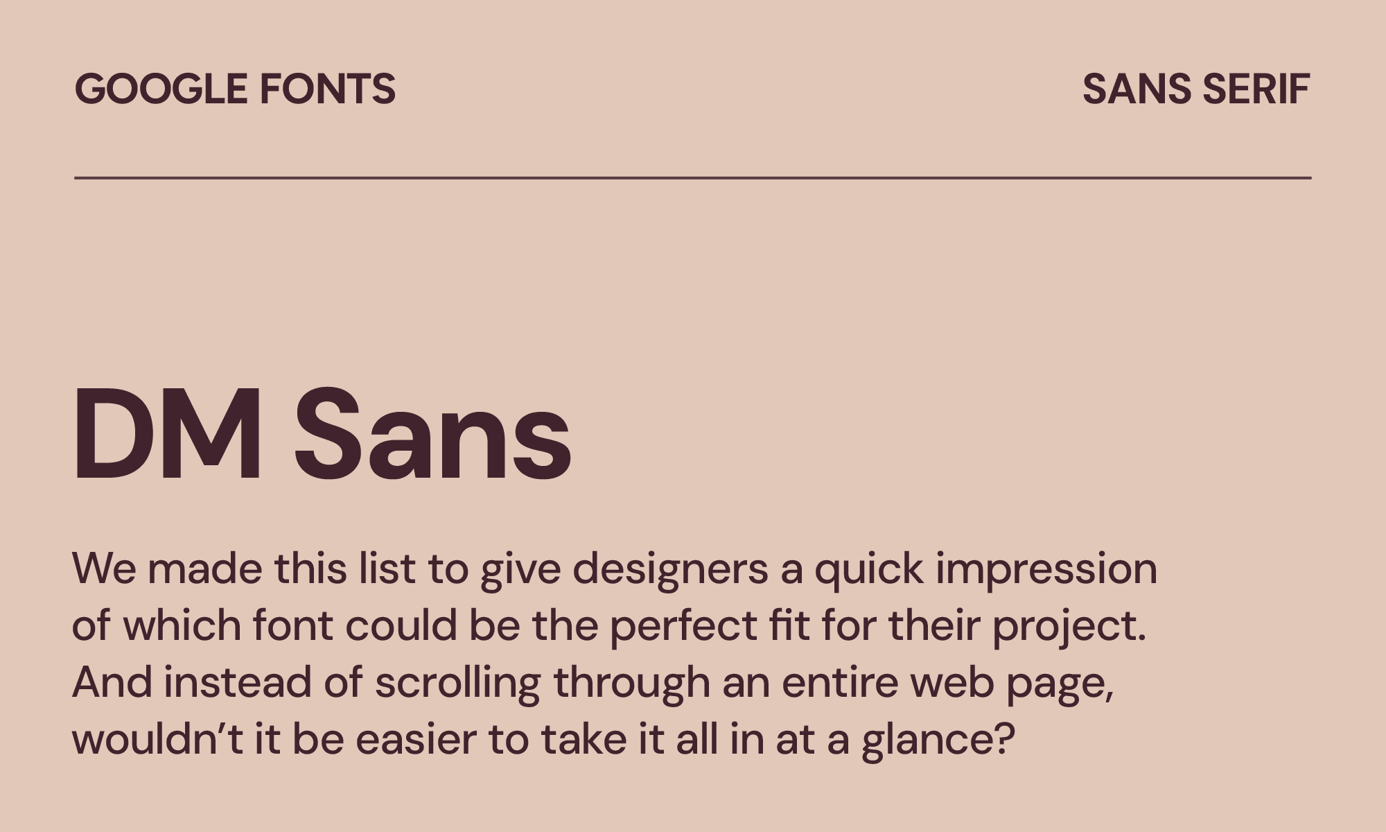
DM Sans
| Classification | Sans serif |
|---|---|
| Designer | Colophon Foundry |
| Styles | 18 |
| Link | Download DM Sans |
DM Sans pairs beautifully with display serifs and has enough character to hold its own in large headlines without needing a companion. That makes it a good choice for editorial websites or agency portfolios. In fact, DM Sans might be the most versatile font on this entire list.
DM Sans compares well to other fonts like Circular or Gilroy, with the same friendly geometry.
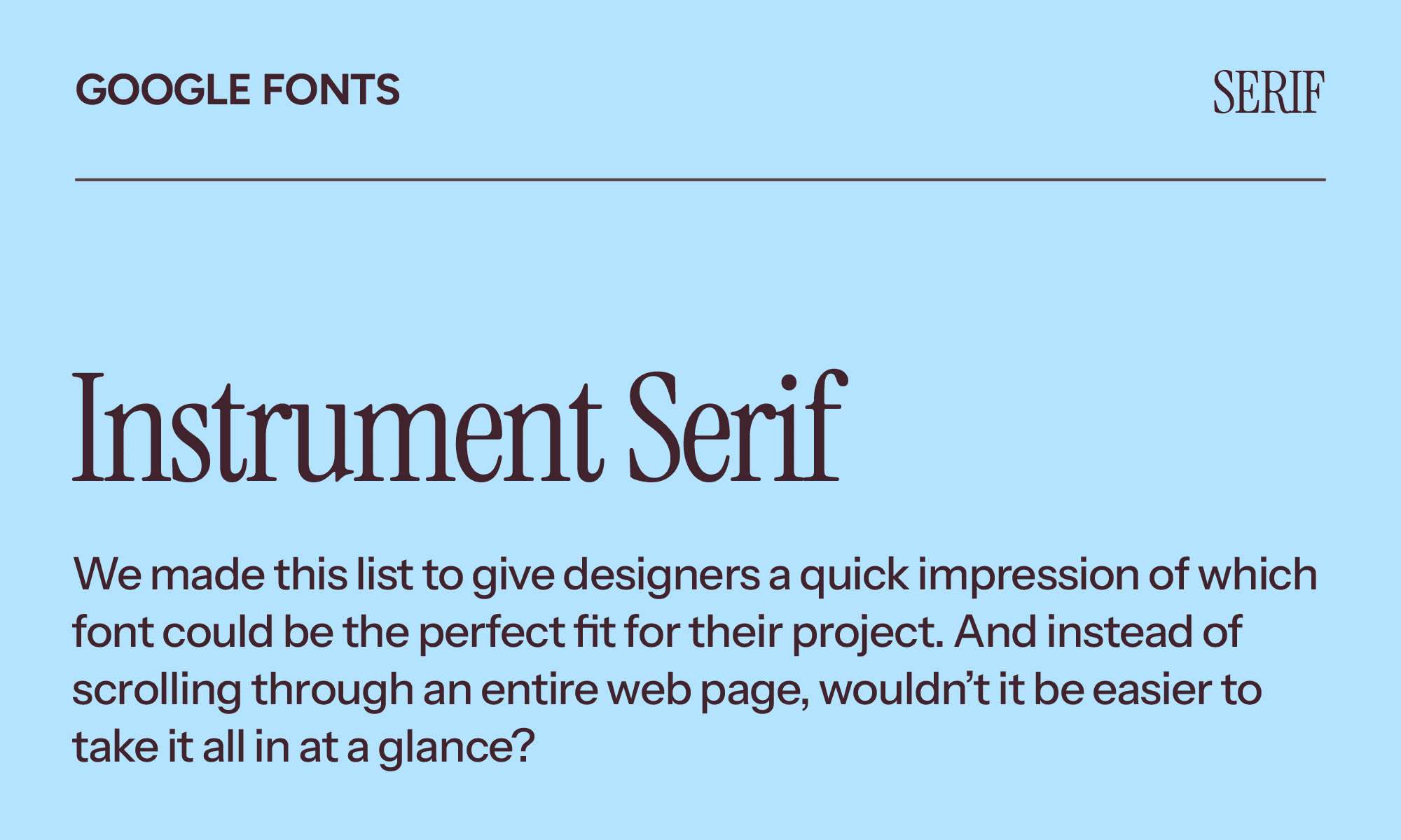
Instrument Serif
| Classification | Serif |
|---|---|
| Designer | Rodrigo Fuenzalida & Jordan Egstad |
| Styles | 2 |
| Link | Download Instrument Serif |
Instrument Serif is designed to stand out in large sizes and brings a touch of modernity to old-style serifs. It looks excellent as a webpage header or a magazine headline.
If you already like Cormorant Garamond, you'll love Instrument Serif. It shares that elegant contrast between thick and thin strokes, but feels slightly more contemporary and less historicist. It’d be a great choice for luxury brands and high-end editorial layouts.
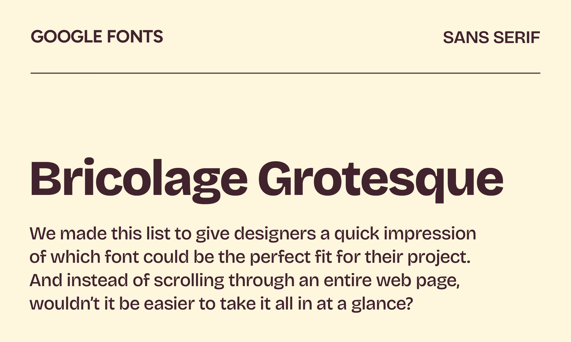
Bricolage Grotesque
| Classification | Sans serif |
|---|---|
| Designer | Mathieu Triay |
| Styles | 7 |
| Link | Download Bricolage Grotesque |
Designer Mathieu Triay says his font Bricolage Grotesque has a touch of French attitude. It has optical corrections baked in that make it feel almost hand-touched. Don't use it for a bank, but do use it for a zine, a studio, or anything that should feel handmade.
You’ll notice similarities to Mayenne Sans and Antique Olive, but try this font instead if you want even more personality in your projects.
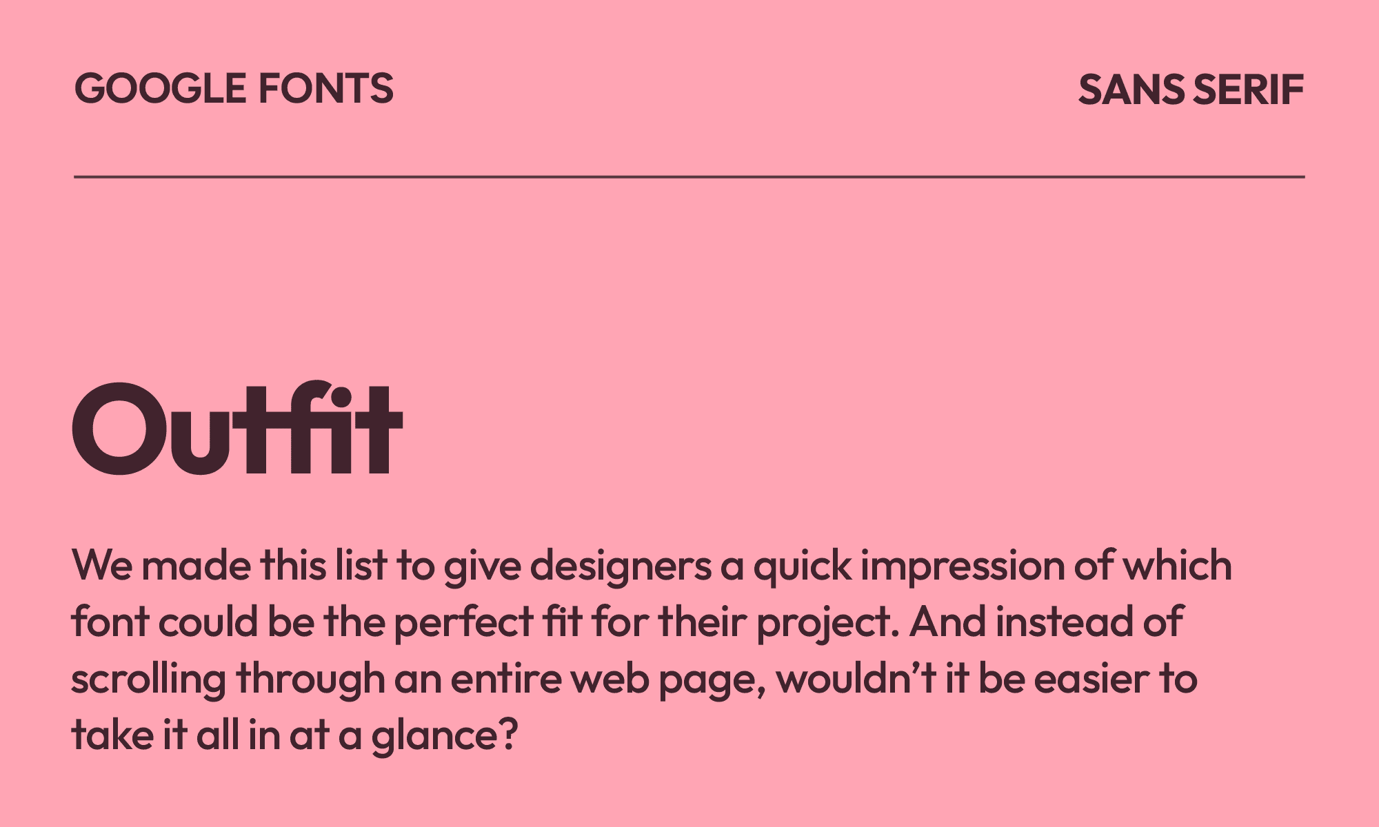
Outfit
| Classification | Sans serif |
|---|---|
| Designer | Smartsheet Inc. & Rodrigo Fuenzalida |
| Styles | 9 |
| Link | Download Outfit |
As the official font for Outfit.io, Outfit works best for consumer apps, e-commerce sites, and tech startups that want to feel approachable and modern without much typographic risk.
If you’re a fan of fonts like Satoshi or Sturve, Outfit is a similar alternative with less exaggerated proportions. It reads more grown-up at small sizes.
Overall, Outfit is good, but it exists in a crowded space of "friendly geometric sans-serifs" and doesn't always stand out.
Newsreader

| Classification | Serif |
|---|---|
| Designer | Production Type |
| Styles | 14 |
| Link | Download Newsreader |
As the name might suggest, Newsreader is the perfect choice for long-form publishing, digital magazines, newsletters, and any context where someone will actually read a lot of text. It was designed specifically for on-screen reading at long lengths.
It’s most comparable to Georgia, but it adds a little more warmth with a wider range of weights. The variable version is especially impressive for responsive editorial layouts, especially if you want to add pizzazz to certain pages.
Geist Mono
| Classification | Monospaced |
|---|---|
| Designer | Vercel |
| Styles | 9 |
| Link | Download Geist Mono |
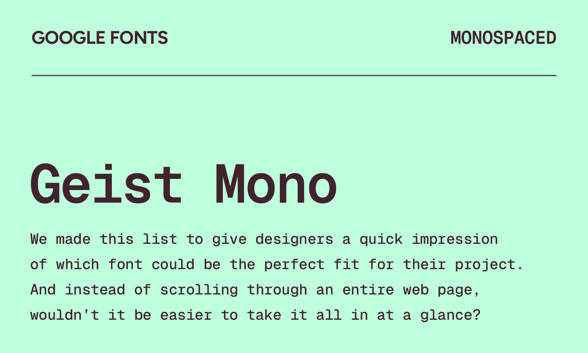
Geist Mono was created specifically for developers and designers. It’s simple and minimalistic, making it a great choice for documentation sites, code snippets, and any design context where the monospace font needs to feel premium rather than utilitarian.
Geist Mono would be good for fans of Fira Code or JetBrains Mono who are looking for a more design-forward character that can also work well in UI contexts. But one problem with this font is its lack of flow, likely due to the exaggerated spacing.
Zalando Sans
| Classification | Sans serif |
|---|---|
| Designer | Jakob Ekelund, KH Type & Zalando |
| Styles | 16 |
| Link | Zalando Sans on Google Fonts |
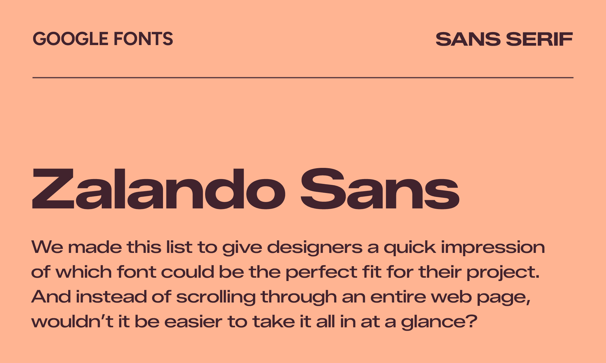
The interesting thing about Zalando Sans is its versatility. You could use it for nearly anything, from fashion retail to lifestyle brands to e-commerce. As a clean sans, it handles both product names and small print without breaking down.
Zalando Sans is great for fans of Helvetica Neue. It’s a bit more compressed, which makes it a little easier to read at smaller text sizes. Overall, it brings a dash of bold fun to whatever project you’re working on.
Geom
| Classification | Sans serif |
|---|---|
| Designer | Thanos Poulakidas |
| Styles | 14 |
| Link | Geom on Google Fonts |
Square, geometric font Geom draws direct inspiration from 1980s robot animations, making it a good way to inject fun into your next title or large headline. It’s best for tech companies, industrial brands, and architectural firms because it’s more interesting than other sans-serif fonts that are all curves or straight lines.
Lovers of Euclid Circular or Neue Haas Grotesk will also appreciate Geom. It has that same sharp, constructed quality that feels like it was drawn with a compass, not a hand.
Marcellus
| Classification | Serif |
|---|---|
| Designer | Astigmatic |
| Styles | 1 |
| Link | Download Marcellus |
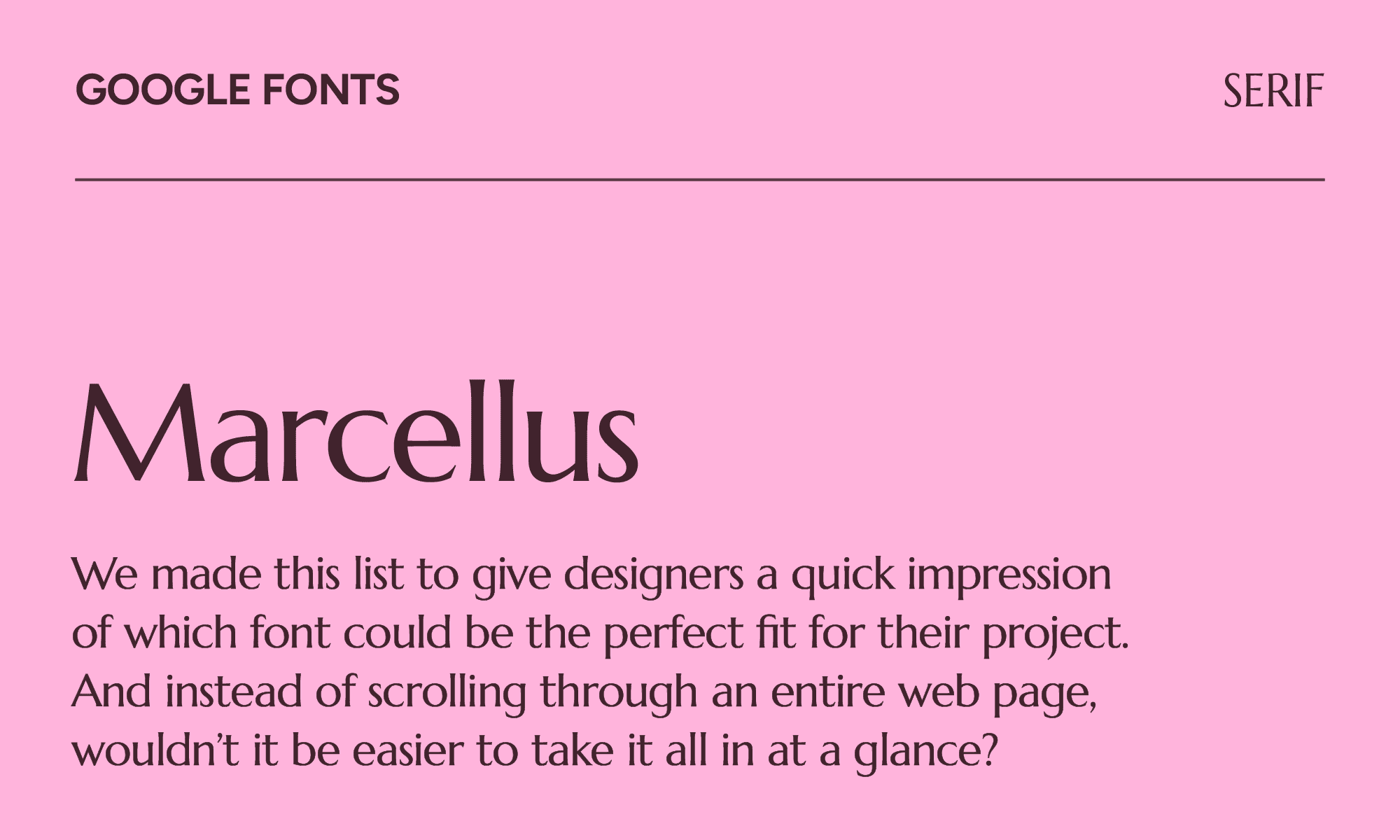
The thin, delicate lines of Marcellus exude elegance. You can see right away that it draws inspiration from classic Roman inscription letterforms, similar to other fonts like Cormorant. It would look spectacular in branding for jewelry stores or spa and wellness businesses, but it could also be used on book covers or wedding stationery because it has a romantic edge.
The only problem is that Marcellus only has one style, which is a real limitation. Because of that, avoid using it in body copy.
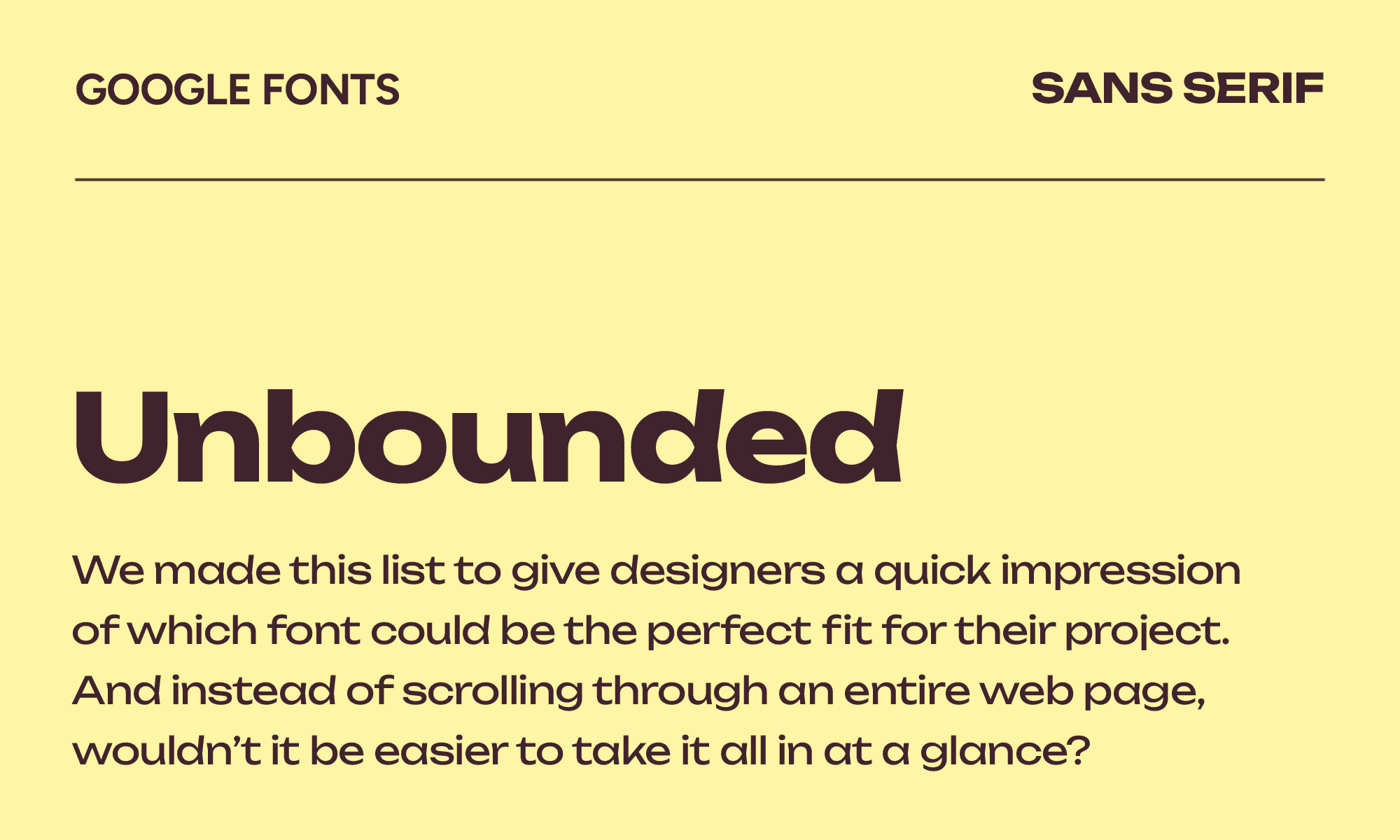
Unbounded
| Classification | Sans serif |
|---|---|
| Designer | NaN |
| Styles | 9 |
| Link | Download Unbounded |
Looking for an alternative to Syne or Monument Extended? You’ve found it with Unbounded, a font with grotesque and humanist construction that uses chevron-shaped stems on key glyphs to stand out. Also interesting are the fish-like counters on bowl letters like “b” or “d.”
The heavy weights are extraordinary for big, punchy headlines, but don't use them for body text—the wide letterforms kill readability at small sizes. But for anything that needs to take up space on a page, few fonts do it better.
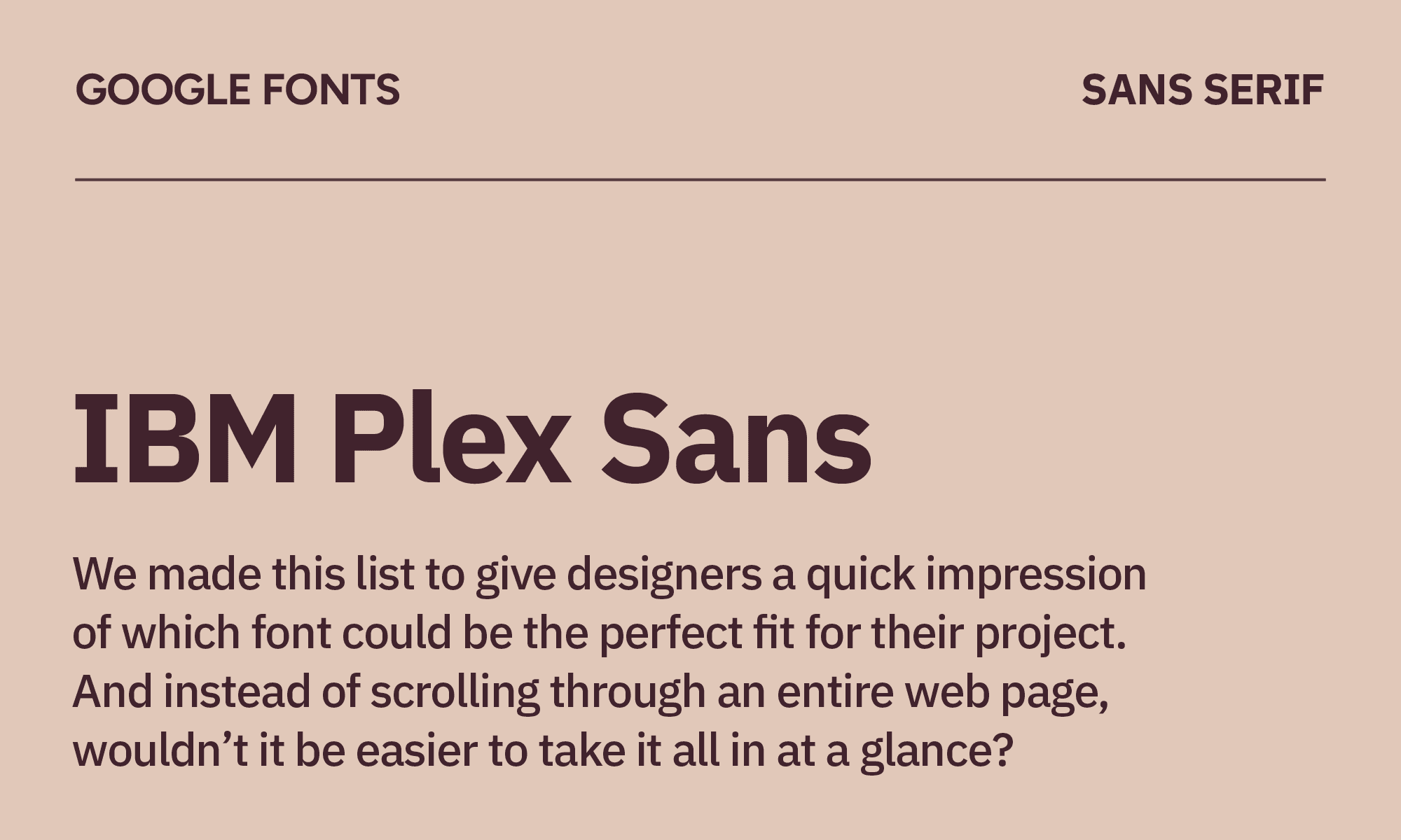
IBM Plex Sans
| Classification | Sans serif |
|---|---|
| Designer | Mike Abbink & Bold Monday |
| Styles | 14 |
| Link | Download IBM Plex Sans |
IMB Plex Sans works great for developer documentation and technical publications—it is the custom font for IBM, after all. It also comes in serif and monospaced iterations, allowing for cohesion across a wide spectrum of projects. If you're building anything that needs to feel serious and intelligent, this is the move.
Use IMB Plex Sans if you like Source Sans Pro, as it shares that clear, technical quality but has more personality.
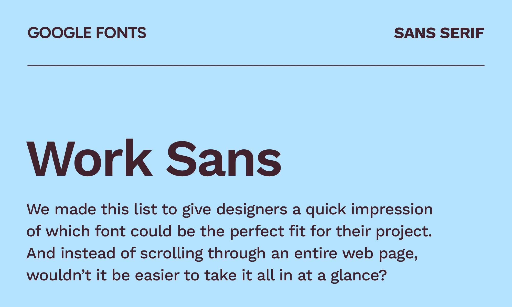
Work Sans
| Classification | Sans serif |
|---|---|
| Designer | Wei Huang |
| Styles | 18 |
| Link | Download Work Sans |
Work Sans is based on early grotesque fonts and is best for medium-sized text, somewhere between 14 and 48 px. Because it has larger diacritic marks, this makes it simpler for screen resolutions. It works well if you want an alternative to Lato because it’s just as neutral but has slightly more versatility.
Work Sans isn’t the most exciting font; it’s like the journeyman of the Google Fonts library. But that’s what makes it excel for SaaS landing pages, product marketing and other general-purpose branding work.
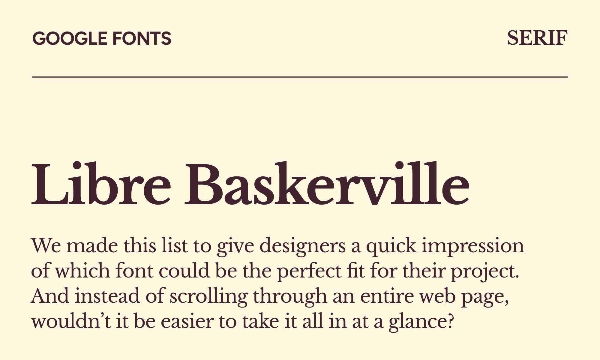
Libre Baskerville
| Classification | Serif |
|---|---|
| Designer | Impallari Type |
| Styles | 8 |
| Link | Download Libre Baskerville |
Libre Baskerville has a beautiful serif vibe that’s a little bit larger and bolder than standard Baskerville, making it easier to read on e-readers and in print. In particular, it has a taller “x” height and wider counters that let it shine on screens.
Libre Baskerville is a faithful tribute rather than a creative leap, and that's fine—sometimes you just want a twist on a tried-and-true favorite. Try it out in your next book interior design or academic publishing project.
Space Grotesk
| Classification | Sans serif |
|---|---|
| Designer | Florian Karsten |
| Styles | 5 |
| Link | Download Space Grotesk |
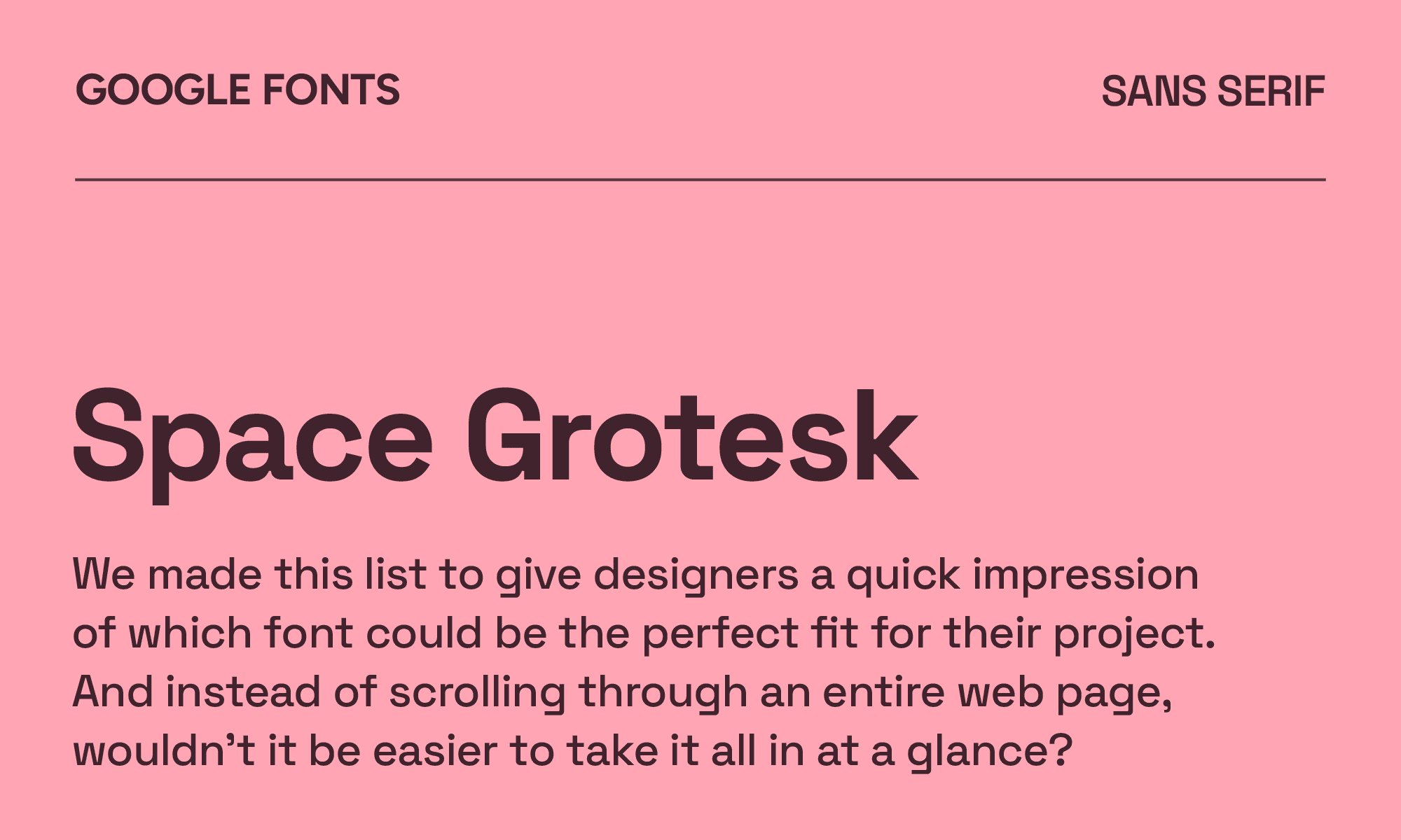
If you thought Space Grotesk looked familiar, that’s because it’s an adaptation of Space Mono, just without the monospaced format. This makes it more readable at non-display sizes.
The structured, slightly quirky quality, like the ear on the lowercase 'g' and the angled terminals, is quite enjoyable.
Space Grotesk is everywhere in tech right now, which means it's starting to lose some of its distinctiveness. Still, it looks great on product landing pages and crypto projects.
Syne
| Classification | Sans serif |
|---|---|
| Designer | Bonjour Monde, Lucas Descroix & George Triantafyllakos |
| Styles | 5 |
| Link | Download Syne |
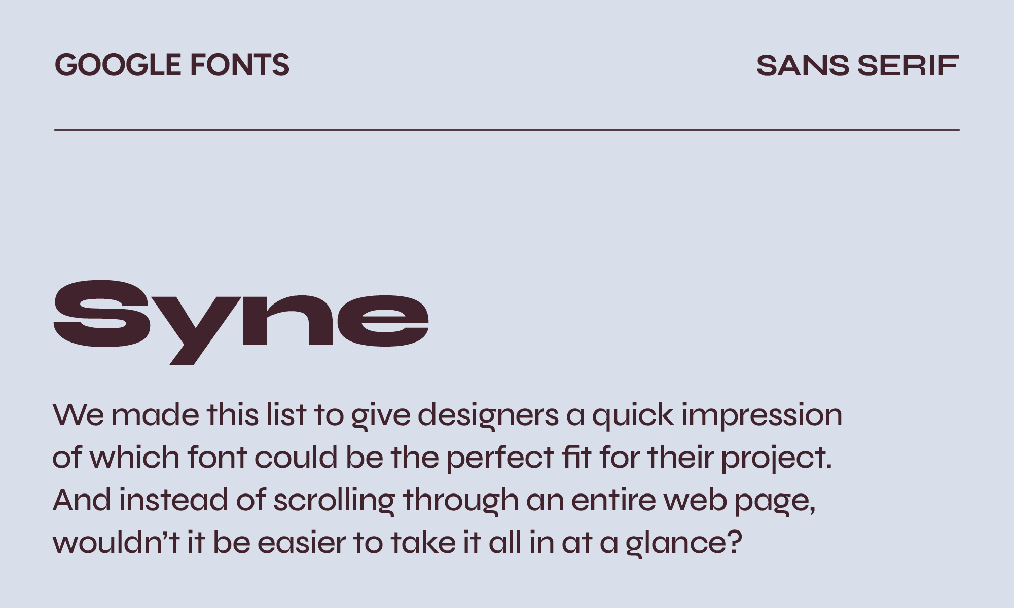
Originally created to be used by an art center in Saint-Denis, France, the Syne font has spread to digital use. It uses a mix of atypical weights and styles to create something wholly unique.
Since it’s already being used by an art center, it would lend itself well to other creative brands and cultural institutions that want an experimental feel. The heavier weights especially have a really unusual presence. It’s a good alternative to Aktiv Grotesk or Neue Montreal.
Instrument Sans
| Classification | Sans serif |
|---|---|
| Designer | Rodrigo Fuenzalida & Jordan Egstad |
| Styles | 8 |
| Link | Download Instrument Sans |
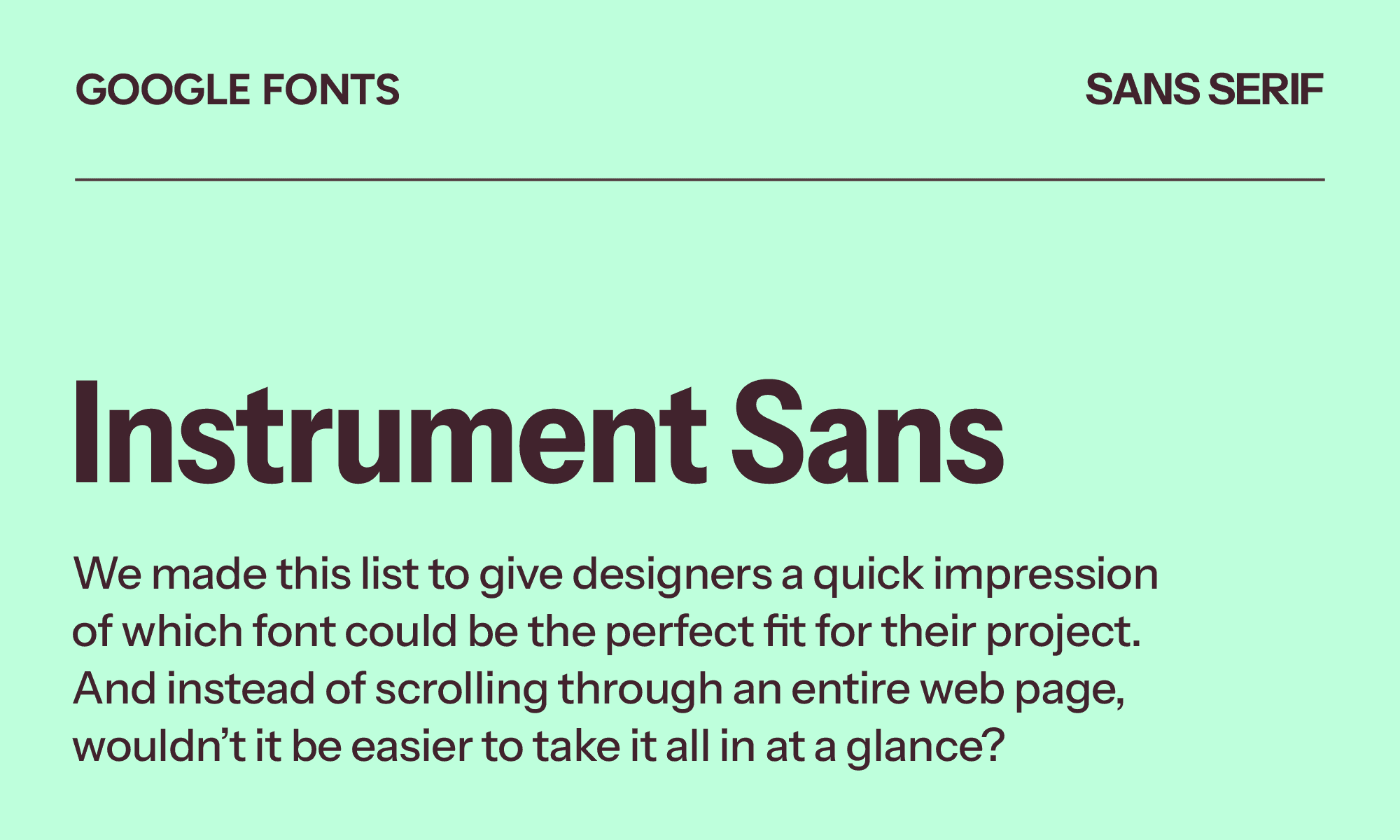
Created specifically for the Instrument brand, Instrument Sans has taken on new life as a font for startups and tech products, particularly on marketing sites. If you like Inter, you’ll like Instrument Sans as well. It has slightly refined letterforms that are more interesting than Inter's strict neutrality.
As a standalone sans, it's solid but not groundbreaking. But when you pair it with its Instrument Serif sibling, you’ll open up a whole new world of design opportunities.
Urbanist
| Classification | Sans serif |
|---|---|
| Designer | Corey Hu |
| Styles | 18 |
| Link | Download Urbanist |
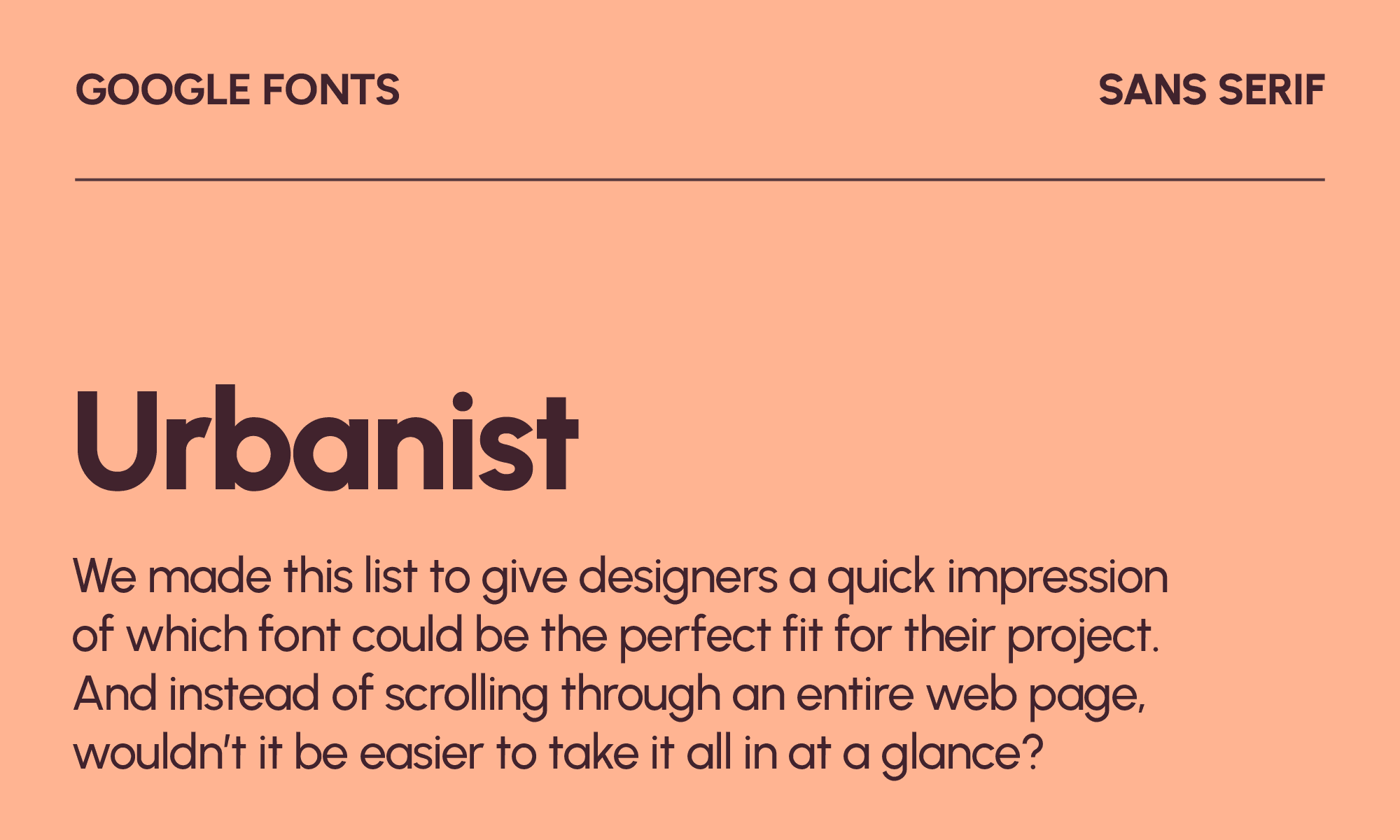
The thin and rounded lines of Urbanist feel both modern and natural. It’s versatile enough that you can use it as a display font for print and digital media, especially in the lifestyle, beauty, wellness and fashion industries.
Urbanist is reminiscent of Nunito or Quicksand because of its friendly, rounded quality, but it’s more sophisticated and less childish. Use it when you want geometric, low-contrast typography.
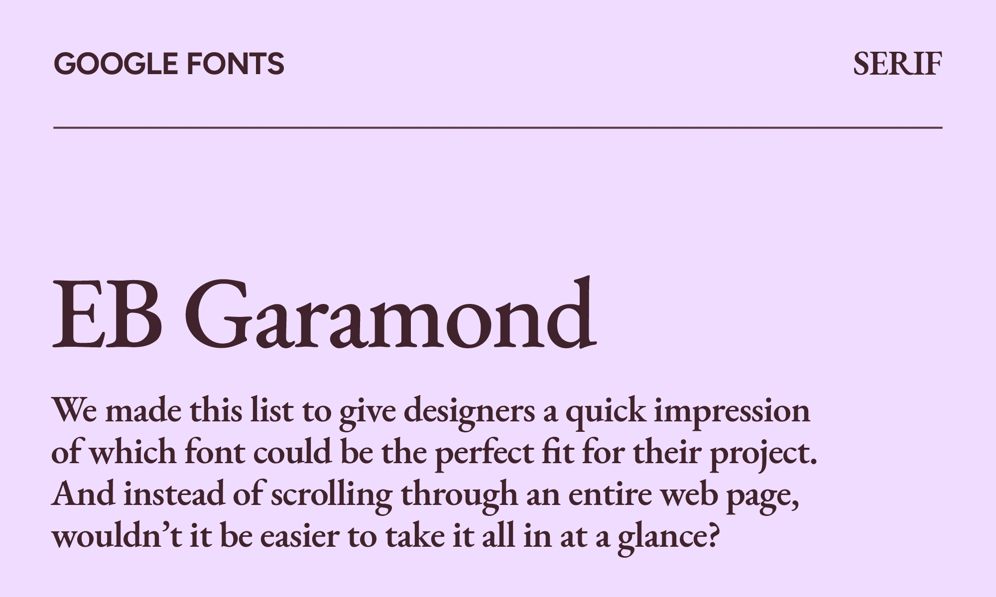
EB Garamond
| Classification | Serif |
|---|---|
| Designer | Georg Duffner & Octavio Pardo |
| Styles | 10 |
| Link | Download EB Garamond |
You might be thinking—another Garamond? But hear us out. EB Garamond shines because it transforms the original mid-16th century type into something for the digital age.
For anyone working in publishing, editorial, or book design, this is one of the most valuable free fonts in existence. Treat it with appropriate respect, and it will reward you. It’s the perfect font to use in book publishing, editorial design, literary magazines, or any other long-form reading content.
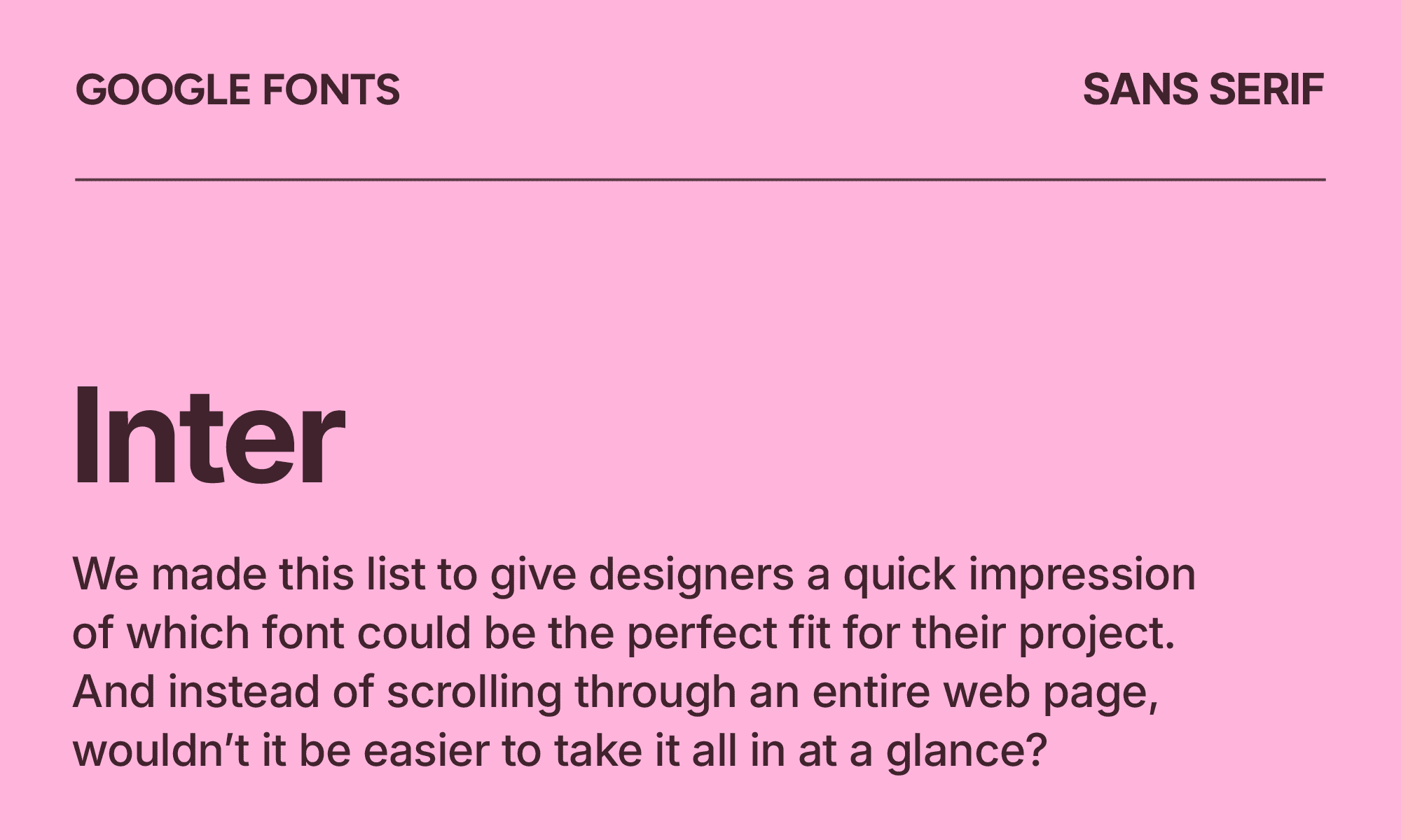
Inter
| Classification | Sans serif |
|---|---|
| Designer | Rasmus Andersson |
| Styles | 18 |
| Link | Download Inter |
Dubbed a “workhorse” by its creator, Inter can be used for anything from marketing and signature to user interfaces. It’s one of the most popular fonts on the internet, meaning it’s functional but rarely the right choice for brand expression.
Its versatile design includes a tall x-height to make lower-case text more legible, as well as ink traps and bridges for better contrast.
Inter is an alternative to Helvetica Neue, simply because it was designed specifically for screen rendering.
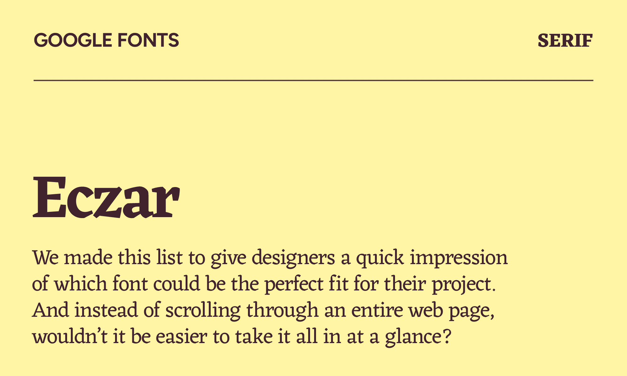
Eczar
| Classification | Serif |
|---|---|
| Designer | Rosetta & Vaibhav Singh |
| Styles | 5 |
| Link | Download Eczar |
Eczar wins the award for originality. The most interesting thing about it is that it can support 45 + 3 languages in Latin and Devanagari scripts. It’s most comparable to Alegreya, but with slightly less structure.
It’s highly expressive and can be used for everything from heavyweight headlines to academic books. However, it excels at adding visual impact as a display font, especially in instances where you’ll be publishing in multiple languages.
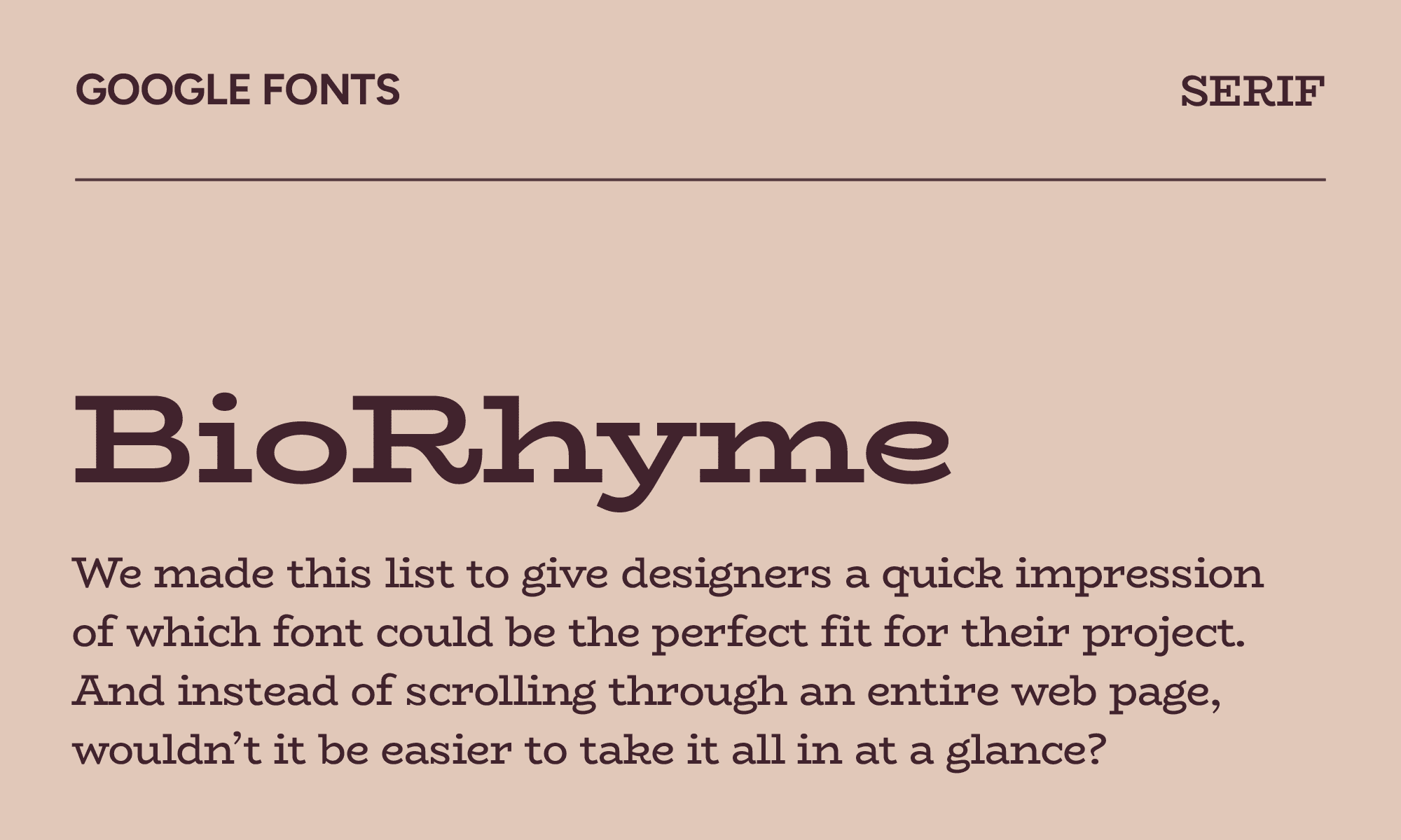
BioRhyme
| Classification | Serif |
|---|---|
| Designer | Aoife Mooney |
| Styles | 7 |
| Link | Download BioRhyme |
BioRhyme may look wild compared to some of the fonts on this list, but that’s because it’s meant for expression, especially in wider and heavier styles. If you’re using its narrower or lighter version, it’s perfect for medium-sized reading—but don’t use it for body copy, as it doesn’t hold up well at small sizes.
BioRhyme is a good dupe of Hepta Slab if you’re looking for something bolder and wider. In particular, the graceful curvy details in the “k” and “g” are a nice twist.
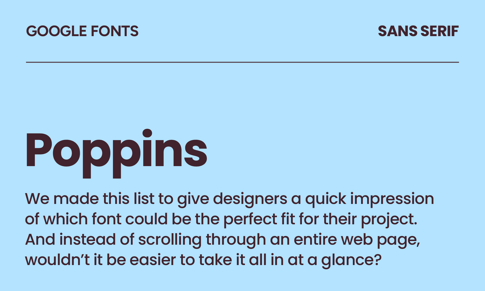
Poppins
| Classification | Sans serif |
|---|---|
| Designer | Indian Type Foundry |
| Styles | 18 |
| Link | Download Poppins |
What sets Poppins apart as a geometric sans serif font is that each letterform is nearly monolinear, balanced by optical corrections on stroke joints. You can see its circular inspiration in nearly every letter.
The only downside is that Poppins is a little overused right now. Every Canva template, every Squarespace site, every quick startup deck seems to reach for it. You might try using Montserrat instead, as it has some of the same rounded qualities without the uniformity.
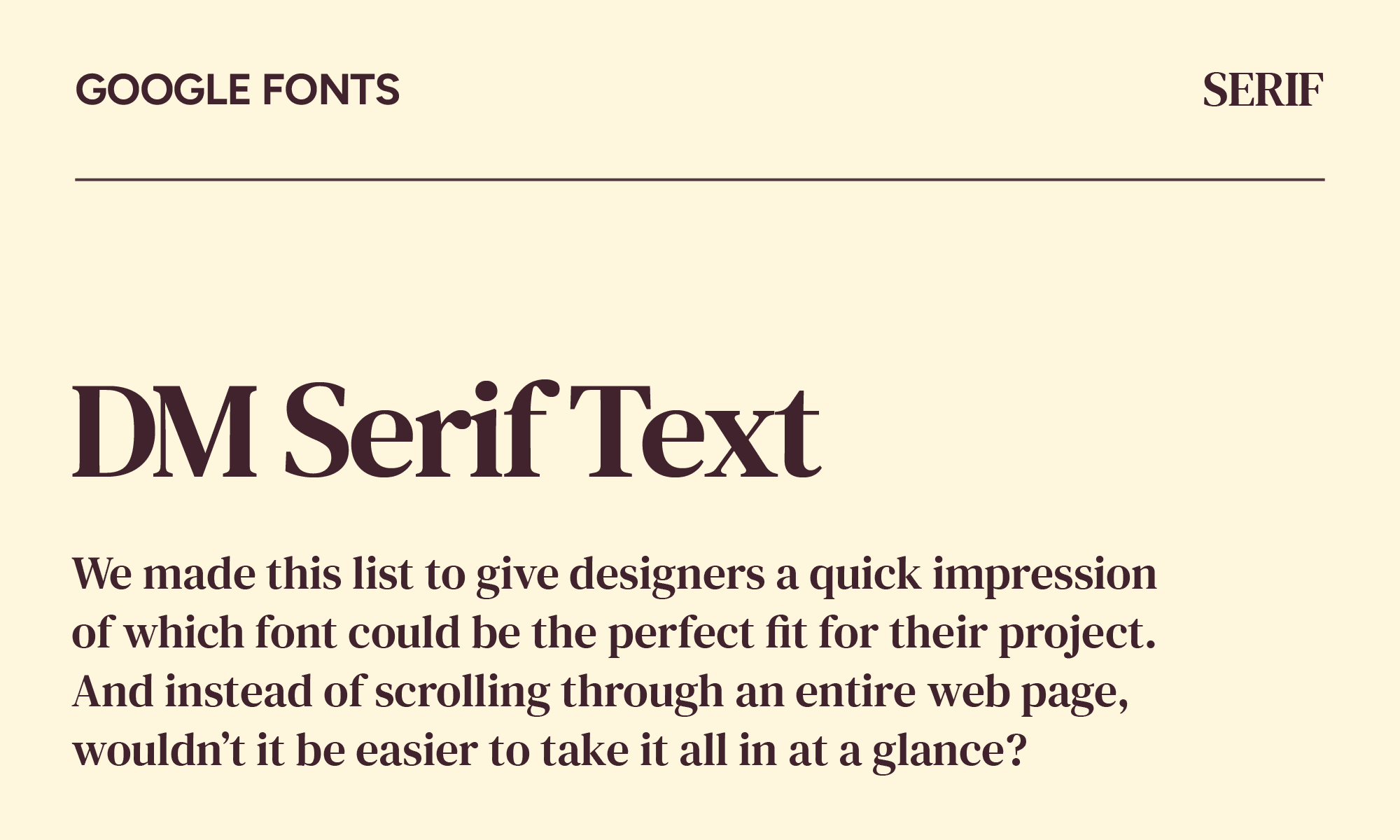
DM Serif Text
| Classification | Serif |
|---|---|
| Designer | Colophon Foundry |
| Styles | 2 |
| Link | Download DM Serif Text |
If you’re searching for a font that doesn't feel as formal as Garamond or as plain as Georgia, DM Serif Text is your new go-to. It’s the counterpart to DM Serif Display and is intended to be used for smaller subheadings and text sizes. It holds up beautifully in long paragraphs and doesn't fall apart at 16px the way a lot of display serifs do.
Consider it for text-heavy editorial content or newsletter layouts.
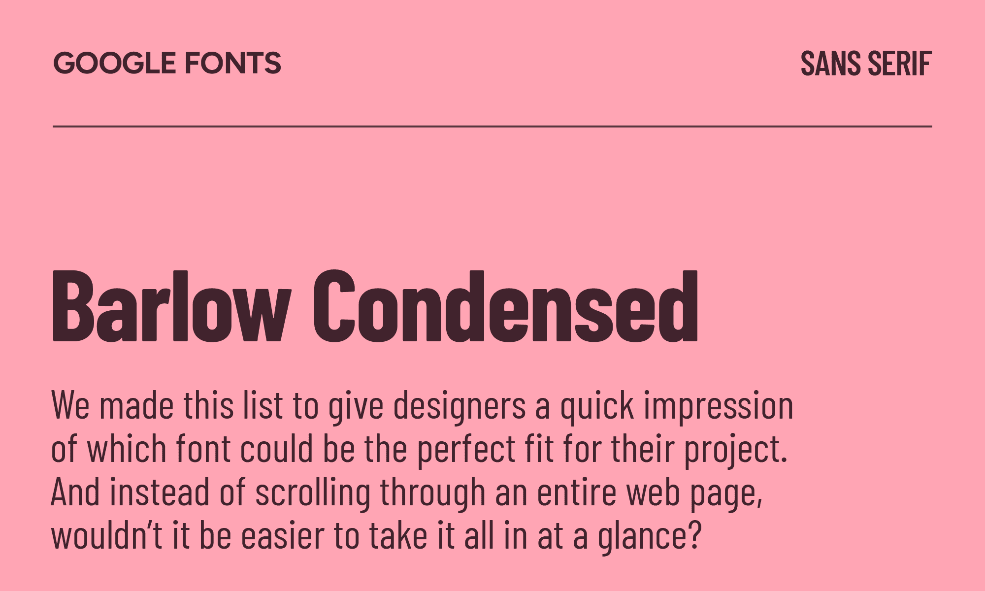
Barlow Condensed
| Classification | Sans serif |
|---|---|
| Designer | Jeremy Tribby |
| Styles | 18 |
| Link | Download Barlow Condensed |
Barlow Condensed does one thing exceptionally well: it makes text feel powerful in small spaces. That makes it particularly useful for packaging, wayfinding, and sports contexts. Think event posters or navigation labels where you need to fit a lot of text in a tight space.
If you already like Oswald, Barlow Condensed could be a good alternative that’s slightly more elegant with a better weight range, especially when it comes to lighter weights.
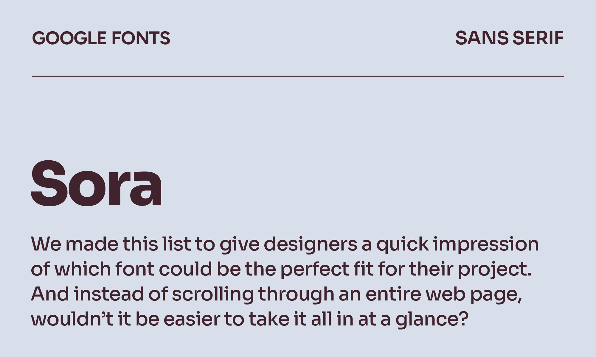
Sora
| Classification | Sans serif |
|---|---|
| Designer | Jonathan Barnbrook & Julián Moncada |
| Styles | 8 |
| Link | Download Sora |
Sora works well for tech products with an Asian market presence, gaming interfaces, and consumer app UI where a clean geometric sans needs slightly more character than a pure neutral. Its big x-height combined with generous counters makes it unique in a growing world of sans serif fonts.
If you already like Noto Sans, you'll love Sora because it shares that careful, cross-script consideration but with more design personality and a warmer feel in the letterforms. It’s underused, but not for long.
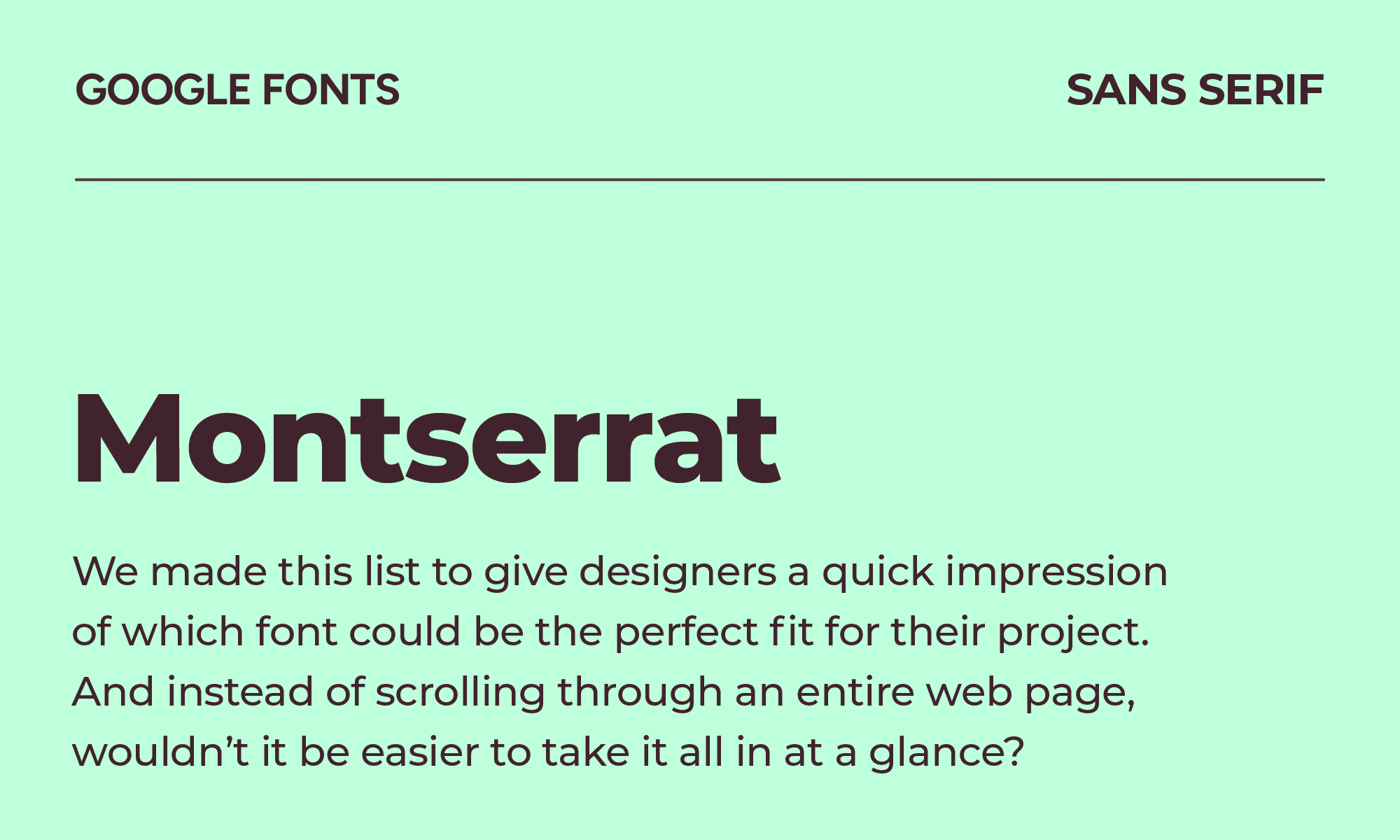
Montserrat
| Classification | Sans serif |
|---|---|
| Designer | Julieta Ulanovsky |
| Styles | 18 |
| Link | Download Montserrat |
Inspired by traditional signage in the Montserrat neighborhood of Buenos Aires, Montserrat channels the same geometric modernist energy as Futura but with better screen performance. For marketing materials, presentation decks, and corporate branding, it delivers.
The problem is what it's been through: Montserrat is the Poppins of five years ago. We’re so used to it appearing on everything. Use it when the brief genuinely calls for it. Don't use it because it's the first font you learned.
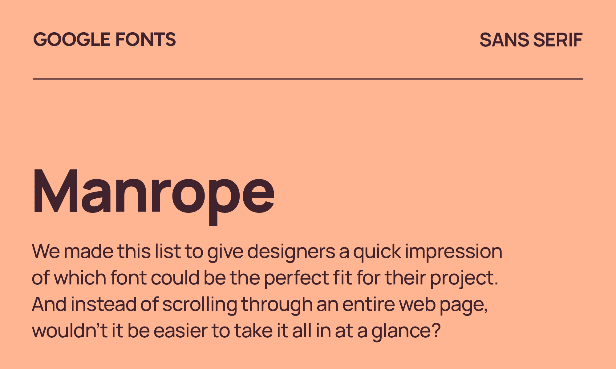
Manrope
| Classification | Sans serif |
|---|---|
| Designer | Mikhail Sharanda |
| Styles | 7 |
| Link | Download Manrope |
Manrope is one of the more underrated fonts on this list. It’s geometric enough to feel professional, warm enough to feel human, and the screen rendering is excellent at small sizes.
It does what Circular does but without the licensing cost. For fintech products, productivity apps, and SaaS dashboards where the type needs to feel trustworthy, Manrope is one of the best decisions you can make.
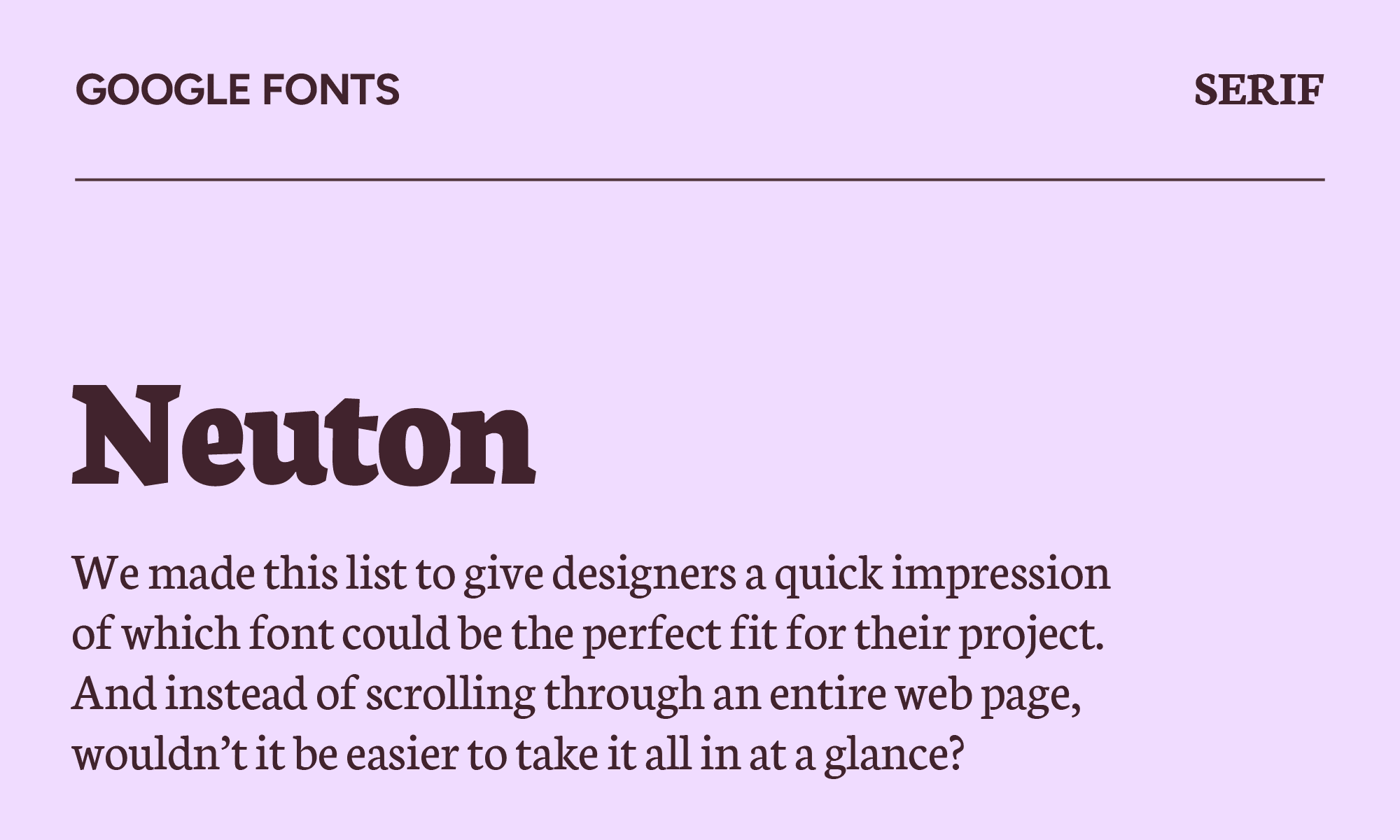
Neuton
| Classification | Serif |
|---|---|
| Designer | Brian Zick |
| Styles | 6 |
| Link | Download Neuton |
Neuton looks conservative at first glance. But in literary and academic publishing, a well-made conservative serif is exactly what the work needs. The proportions are more elegant than Times New Roman, and the screen rendering is better as well.
For personal blogs, literary websites, and academic publishing where the text should feel considered rather than designed, Neuton is a contender. It adds a bit of pizzazz that stands out against other tired, neutral fonts.
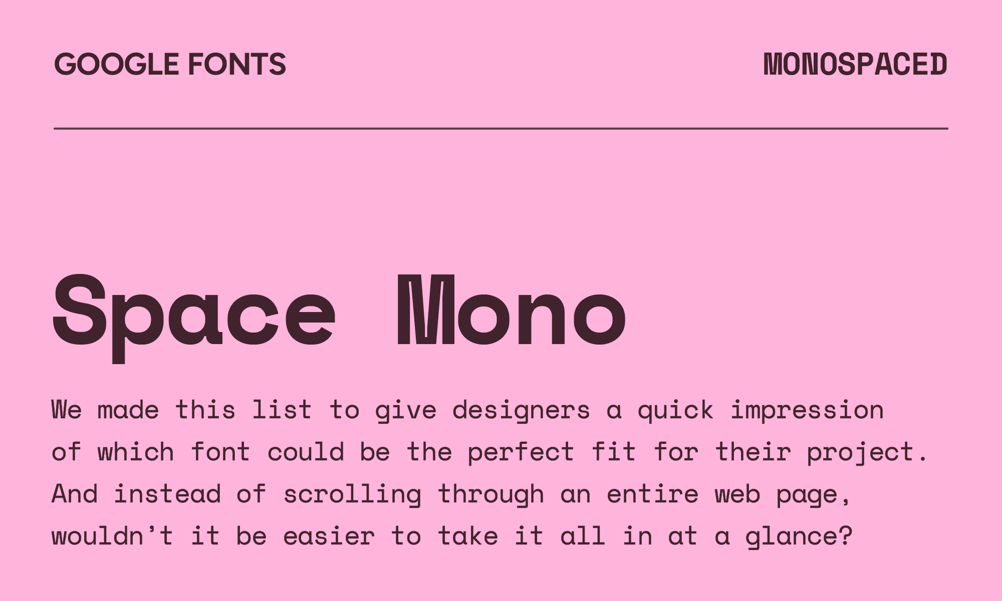
Space Mono
| Classification | Monospaced |
|---|---|
| Designer | Colophon Foundry |
| Styles | 4 |
| Link | Download Space Mono |
Space Mono shines as a headline and display font, with a strong geometric foundation reminiscent of headline typefaces from the 1960s. It’s a bit like Eurostile and Microgramma, with a sci-fi feel that makes it great for retro-futuristic branding or developer portfolios.
If you’re looking for a monospaced font, this is one of the strongest available, with a personality that’ll set you apart from the rest. It’s cleaner, more legible, and has a graphic quality that makes it genuinely interesting.
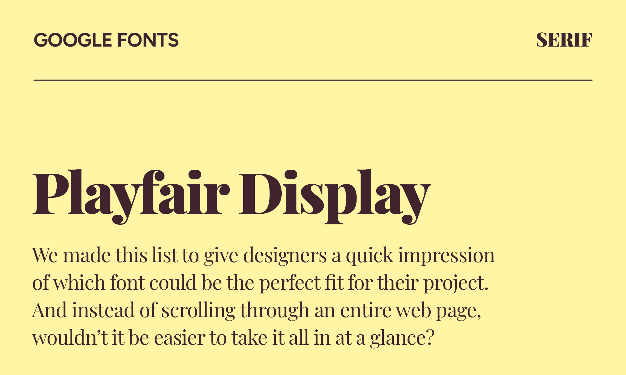
Playfair Display
| Classification | Serif |
|---|---|
| Designer | Claus Eggers Sørensen |
| Styles | 12 |
| Link | Download Playfair Display |
As a transitional design, Playfair draws inspiration from how broad nib quills used to leave delicate hairlines and high-contrast strokes, bringing these into the modern era. It works well as an alternative to Didot and Bodoni if you want something that holds up to digital display.
For editorial headers, fashion sites, and lifestyle brands that want drama and elegance, it's still one of the best tools available. However, it’s been the default "fancy serif" long enough that it's lost some impact.
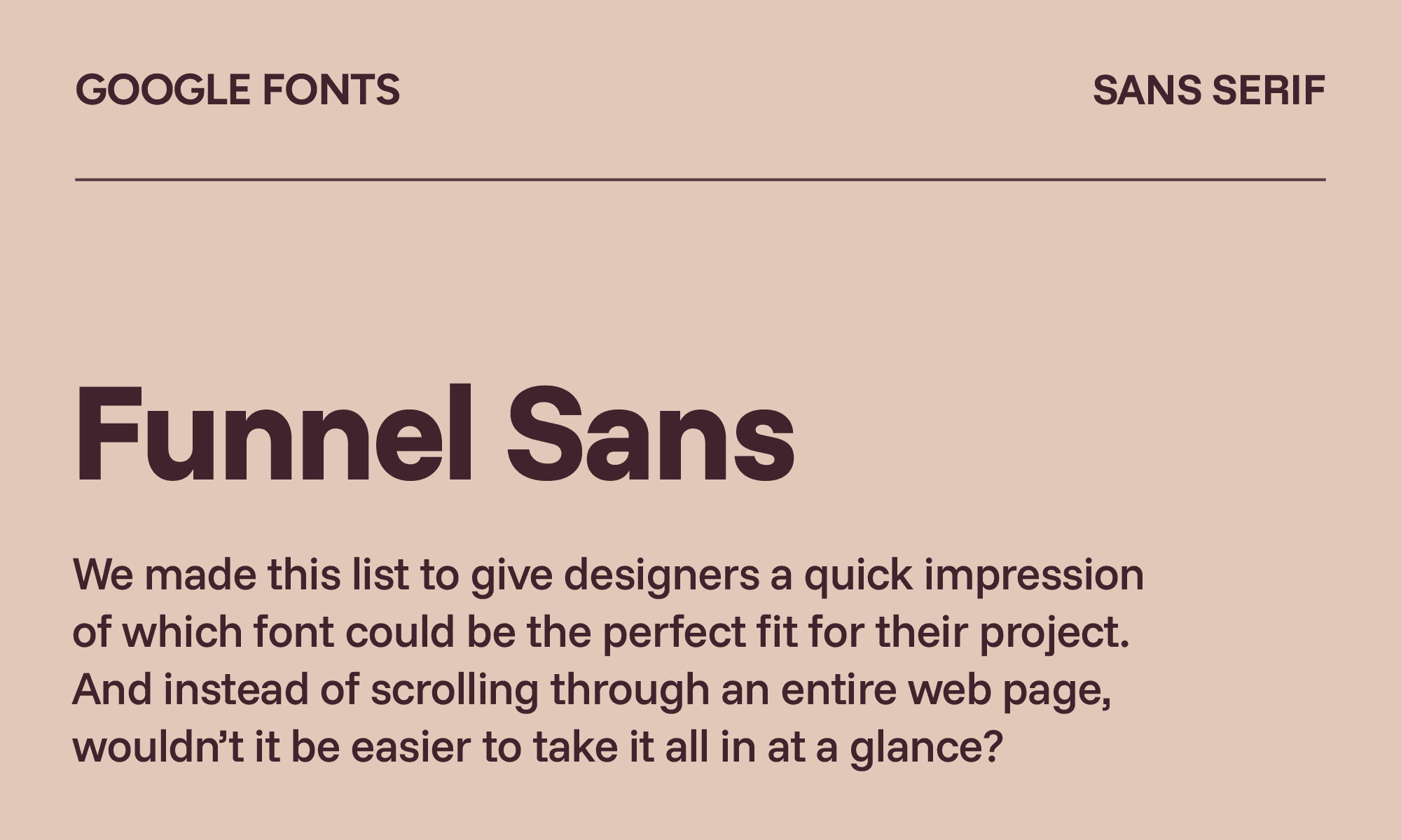
Funnel Sans
| Classification | Sans serif |
|---|---|
| Designer | NORD ID & Kristian Möller |
| Styles | 12 |
| Link | Download Funnel Sans |
If you’re looking for a functional sans serif font, you’ve found it with Funnel Sans. It’s inspired by the movement and shapes of data points, meaning it uses both circular and square shapes in its letterforms.
Compared to a font like Source Sans Pro, it has more careful optical sizing and a slightly more distinctive character. For data-dense products, like data tables, reporting dashboards, or system interfaces, it makes the whole interface feel more professional.
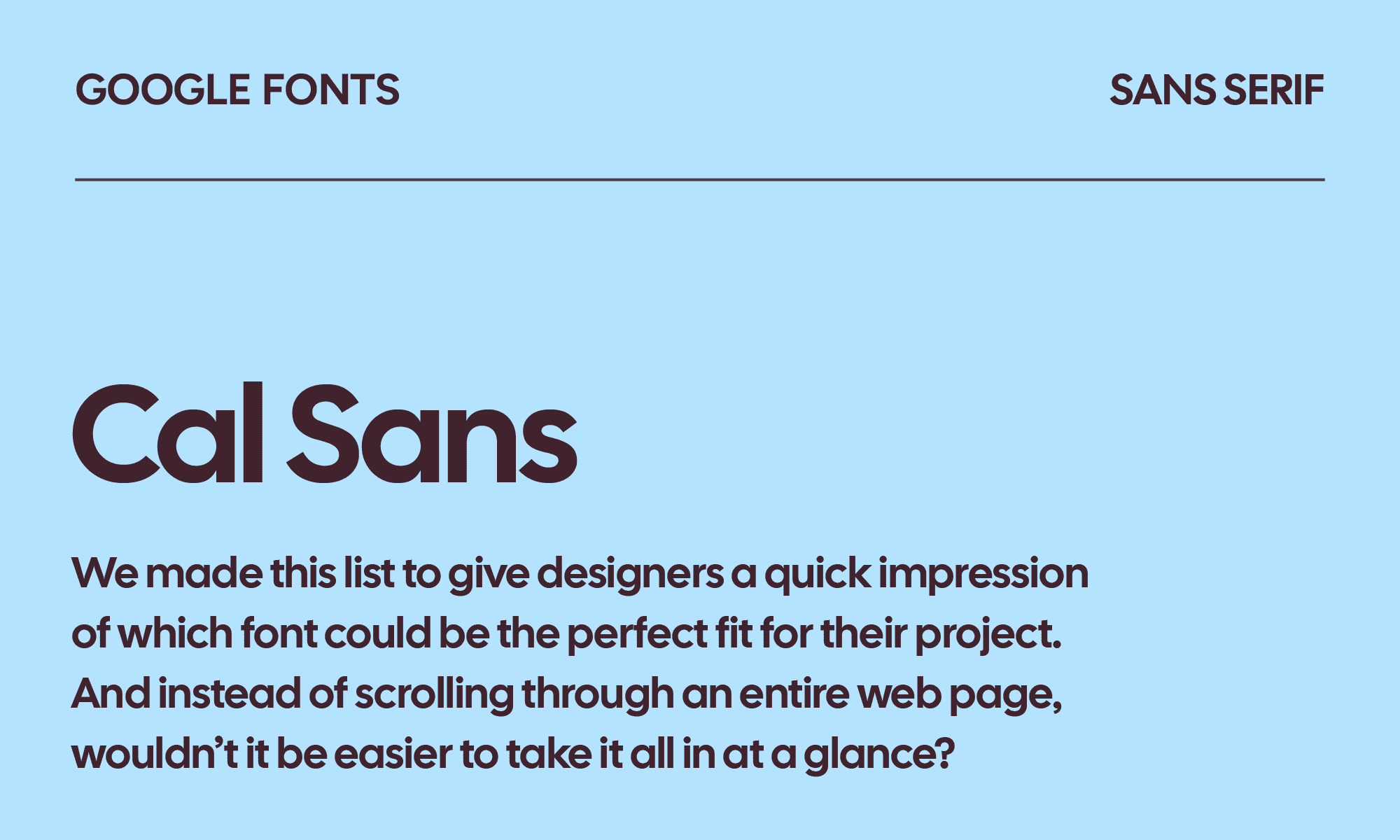
Cal Sans
| Classification | Sans serif |
|---|---|
| Designer | Mark Davis & Cal.com Inc. |
| Styles | 1 |
| Link | Download Cal Sans |
Designed specifically for Cal.com, Cal Sans is an updated take on Futura that’s more modern and less designer-y. It invokes a more serious and geometric look that feels energetic and confident without being aggressive, somewhere in the territory of Satoshi or Plus Jakarta Sans but with a more intentional, less general-purpose character.
Use it for headlines and displays for product brands and startups that want a punchy tone.
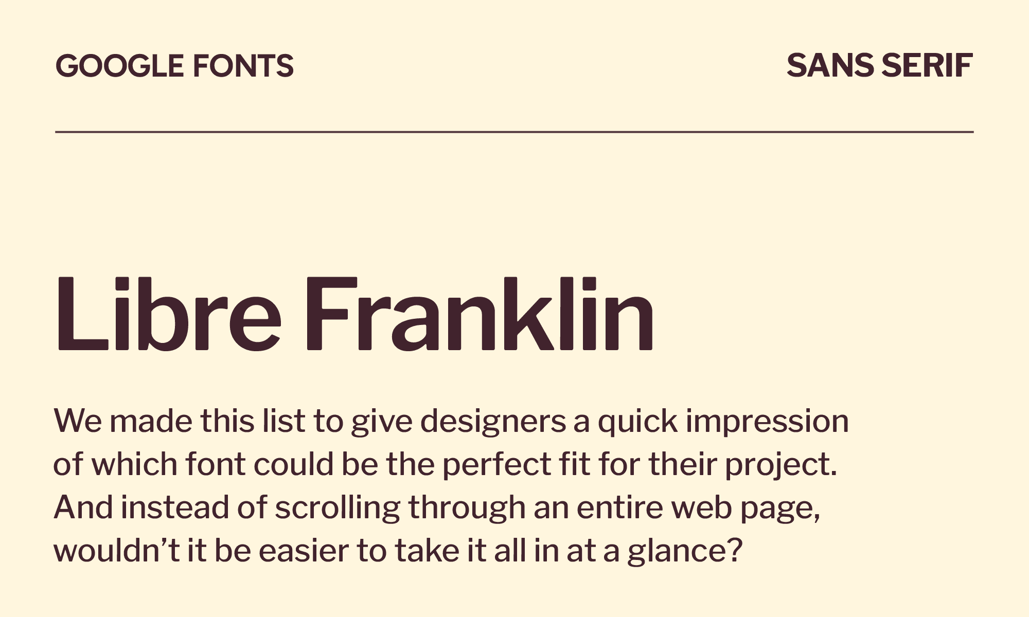
Libre Franklin
| Classification | Sans serif |
|---|---|
| Designer | Impallari Type |
| Styles | 18 |
| Link | Download Libre Franklin |
Libre Franklin expands on the Franklin Gothic font created by Morris Fuller Benton in 1912. It’s not quirky or full of personality, but for news sites, journalism, and content-heavy editorial work, that restraint is the right call.
It looks at home in any context where readability and simplicity are key. If you’re looking for a new font to define your brand, this one isn’t it.
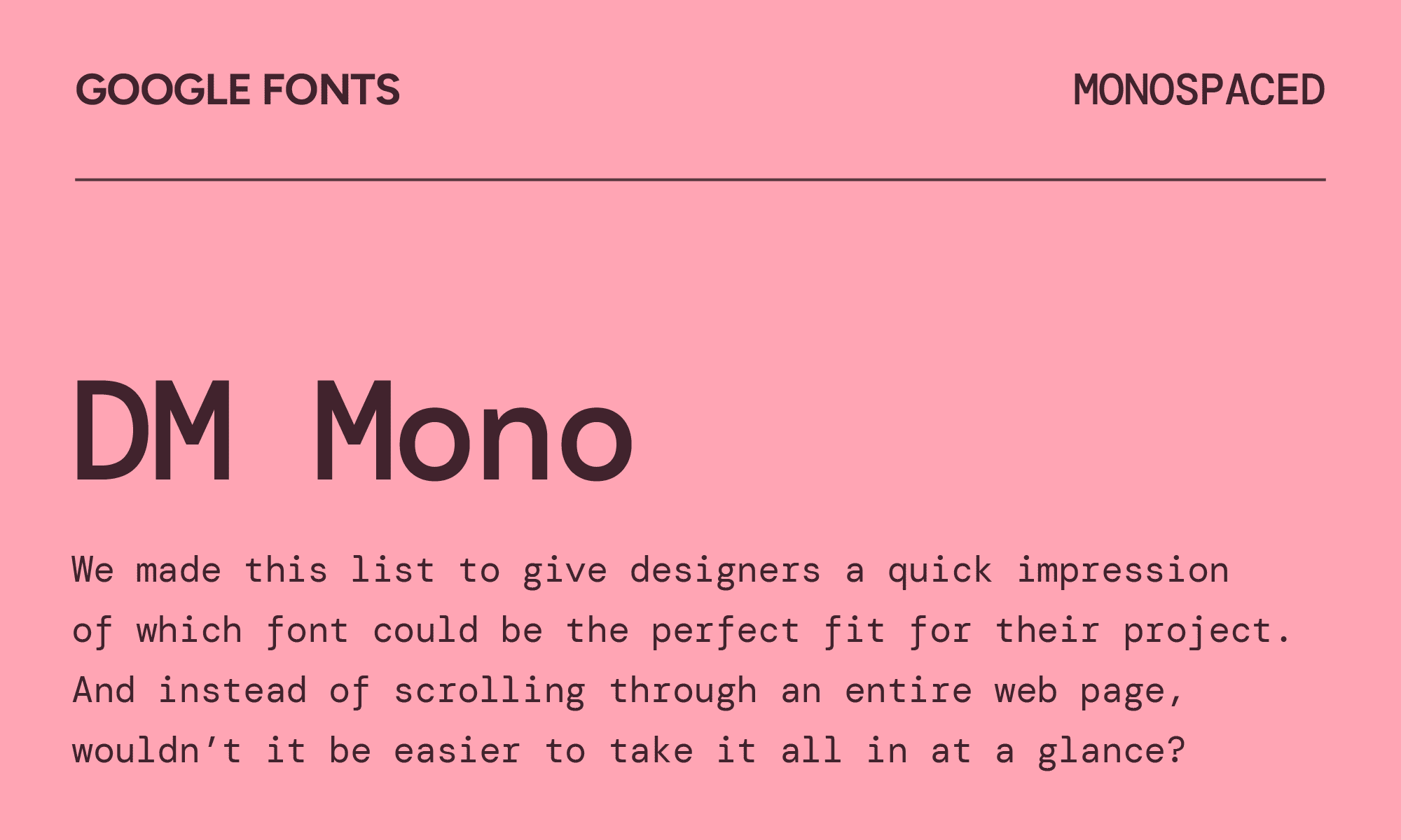
DM Mono
| Classification | Monospaced |
|---|---|
| Designer | Colophon Foundry |
| Styles | 6 |
| Link | Download DM Mono |
Originally designed for DeepMind, DM Mono is like the less geometric version of DM Sans. What sets DM Mono apart from most monospace fonts is that it actually works outside a terminal. It holds up in UI labels, pricing tables, and data displays without looking like it wandered in from a code editor.
If you like IBM Plex Mono, DM Mono is slightly warmer and pairs more naturally within the DM family.
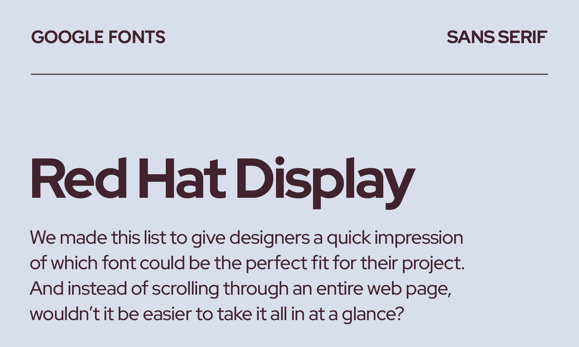
Red Hat Display
| Classification | Sans serif |
|---|---|
| Designer | MCKL |
| Styles | 14 |
| Link | Download Red Hat Display |
MCKL built Red Hat Display for an enterprise context, and the quality of that brief shows. It has the clean technical clarity of Inter or Source Sans, but with more presence in the letterforms—enough character to feel like a choice rather than a default.
The low contrast, tight spacing, and large X-height mean it can handle everything from UI text to keynote headers with real confidence. Pair it with Red Hat Text if you need to add smaller text as well.
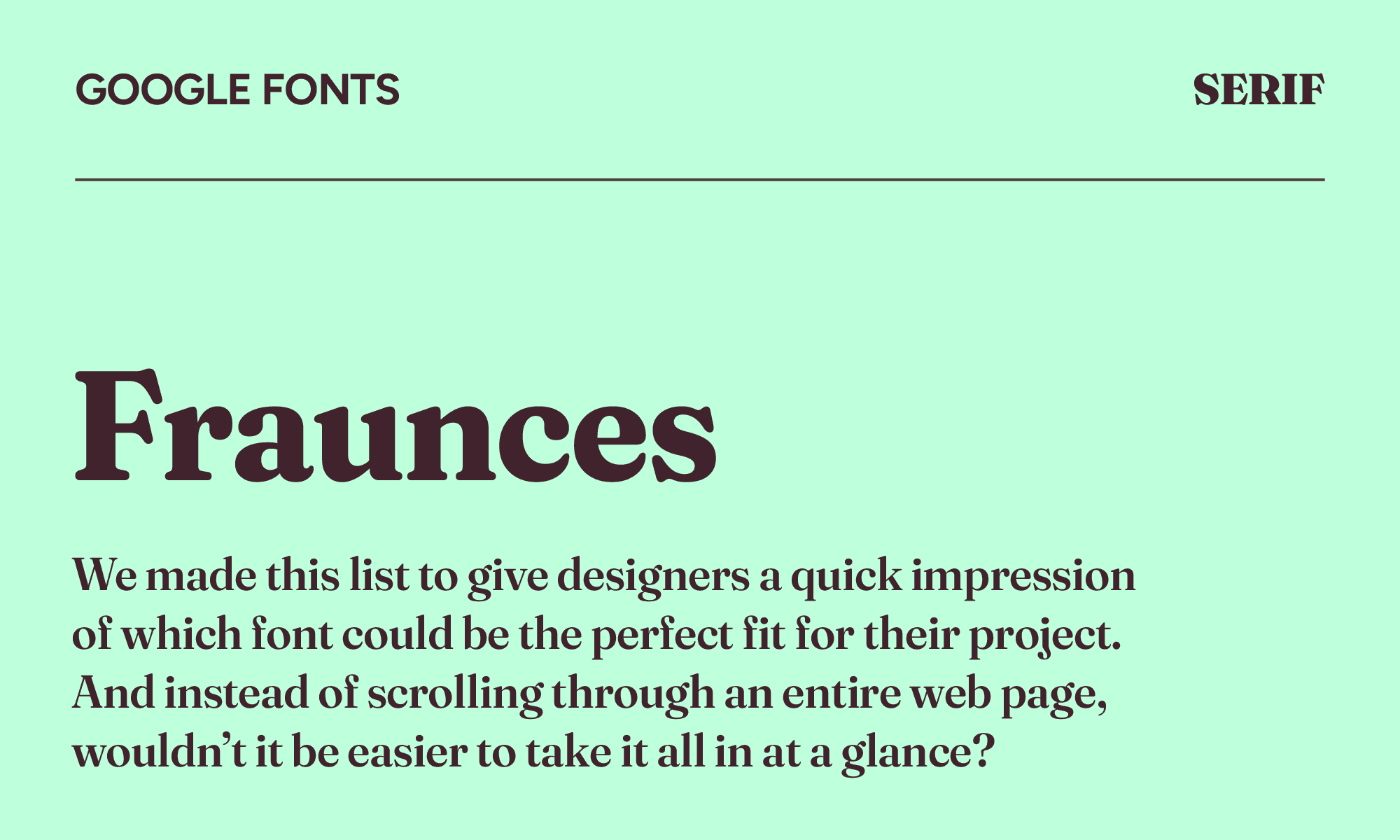
Fraunces
| Classification | Serif |
|---|---|
| Designer | Undercase Type |
| Styles | 18 |
| Link | Download Fraunces |
In the designers’ own words, Fraunces is a “wonky” font similar to Cooper Black, Windsor, and Souvenir. They were inspired by the slightly imperfect, hand-touched quality of early 20th-century typefaces, and they’ve kept that individuality by allowing you to dial in the wonk axis to decide how eccentric you want the letterforms to get.
For food and beverage branding, artisan products, literary fiction, and packaging where the type should feel crafted rather than refined, Fraunces is one of the most interesting serifs released in years.
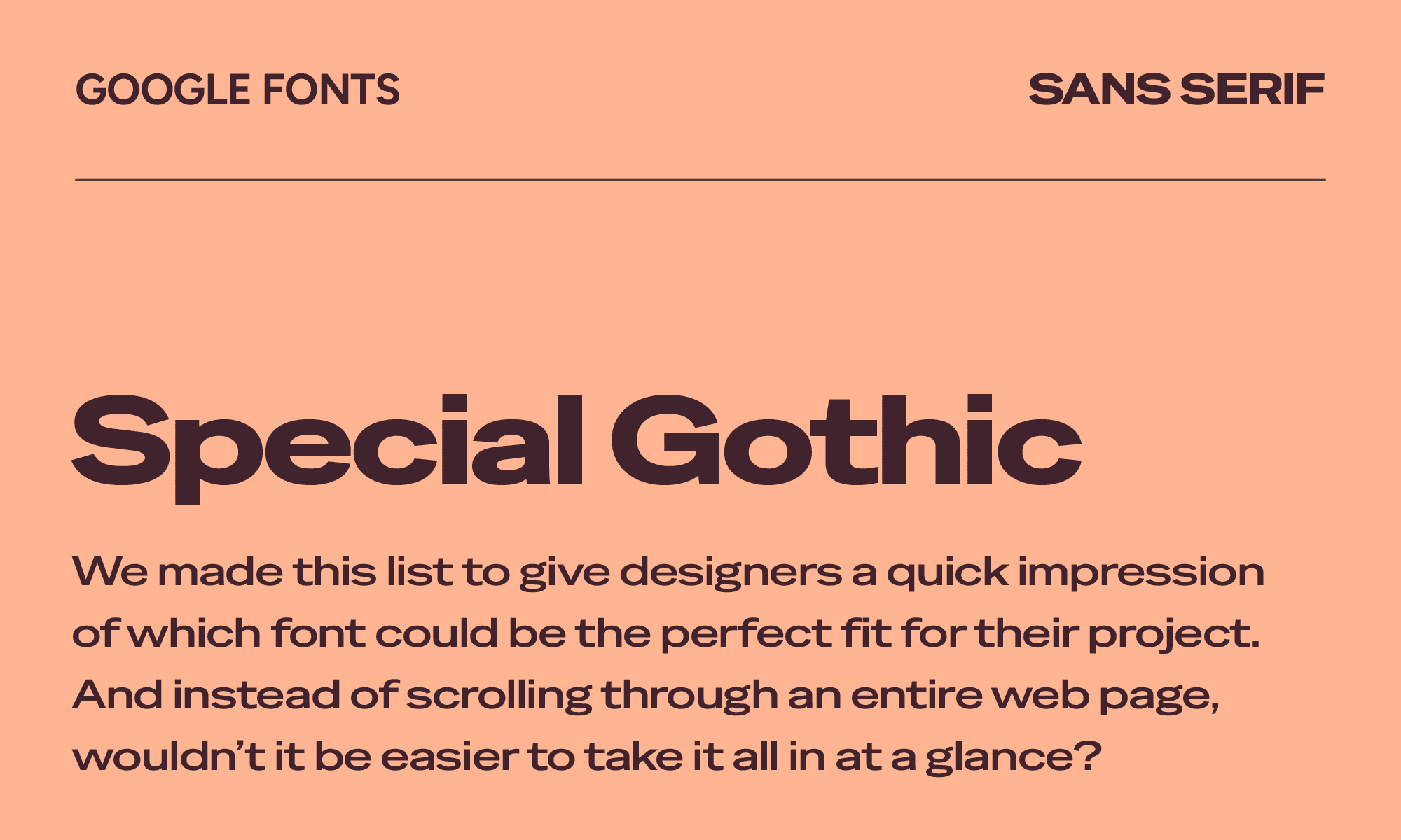
Special Gothic
| Classification | Sans serif |
|---|---|
| Designer | Alistair McCready |
| Styles | 4 |
| Link | Special Gothic on Google Fonts |
When you have a project where you need to toggle different widths, Special Gothic will come in clutch. It has the bones of a classic American condensed gothic—the kind of compressed, high-impact letterforms you'd find in Trade Gothic or Franklin Gothic Condensed—but with a contemporary edge.
For fashion brands, music projects, and editorial work that wants a condensed sans feeling modern rather than retro, it's one of the best modern Google Fonts.
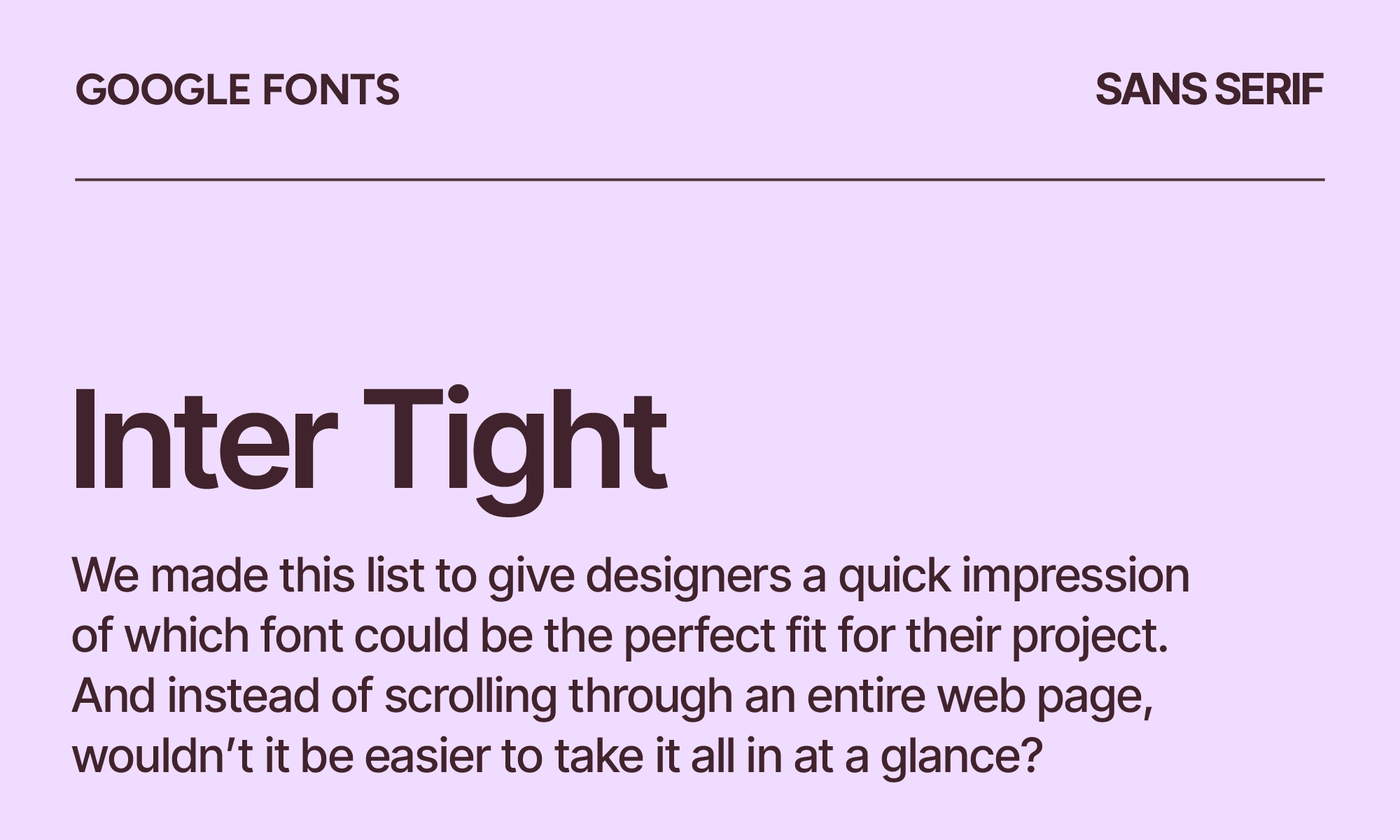
Inter Tight
| Classification | Sans serif |
|---|---|
| Designer | Rasmus Andersson |
| Styles | 18 |
| Link | Download Inter Tight |
Inter is one of the great UI fonts, but it can feel spacious and soft at display sizes. The proportions that make it excellent for body text work against it when you're setting a 72px headline.
Inter Tight solves exactly that problem, tightening the same letterforms for contexts where presence matters. It has the same design DNA, but it’s more assertive at large sizes. It’s best for display headlines, hero sections, and marketing banners.
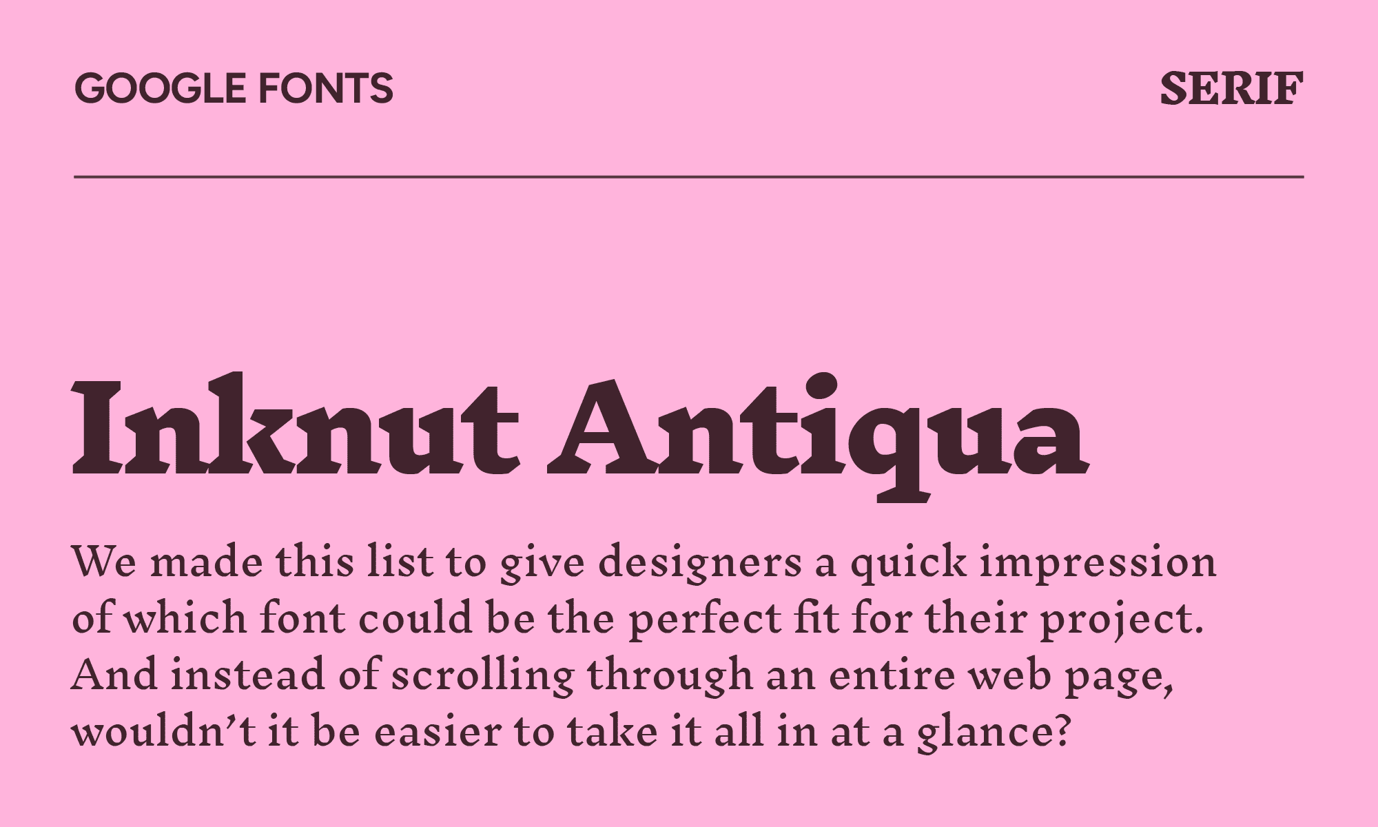
Inknut Antiqua
| Classification | Serif |
|---|---|
| Designer | Claus Eggers Sørensen |
| Styles | 7 |
| Link | Download Inknut Antiqua |
Inknut Antiqua was designed to be a typeface for literature and long-form text, drawing inspiration from Venetian incunabula and humanist manuscripts. Compatible with both Devanagari and Latin, the design decisions across both scripts feel thoughtful rather than bolted on.
For Indic script publishing, literary editorial, and art books, the quality of craft here reaches places most free fonts simply don't. If your project has any connection to South Asian contexts, Inknut Antiqua deserves serious consideration.
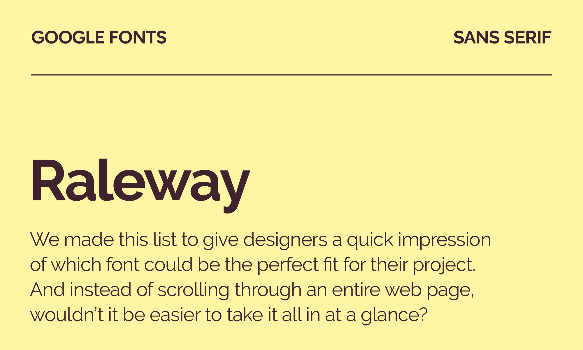
Raleway
| Classification | Sans serif |
|---|---|
| Designer | Matt McInerney, Pablo Impallari, and Rodrigo Fuenzalida |
| Styles | 18 |
| Link | Download Raleway |
When you’re looking for an elegant san serif solution for display face, Raleway is an excellent option. Raleway's ultra-light weights are beautiful, with a distinctive double-story 'W' and geometric elegance, but they've been used so heavily in fashion and lifestyle contexts that they've started to carry some visual clichés.
The heavier weights are more distinctive and significantly underused. Josefin Sans fans will feel at home here, with more weight variety and more letter-level refinement.
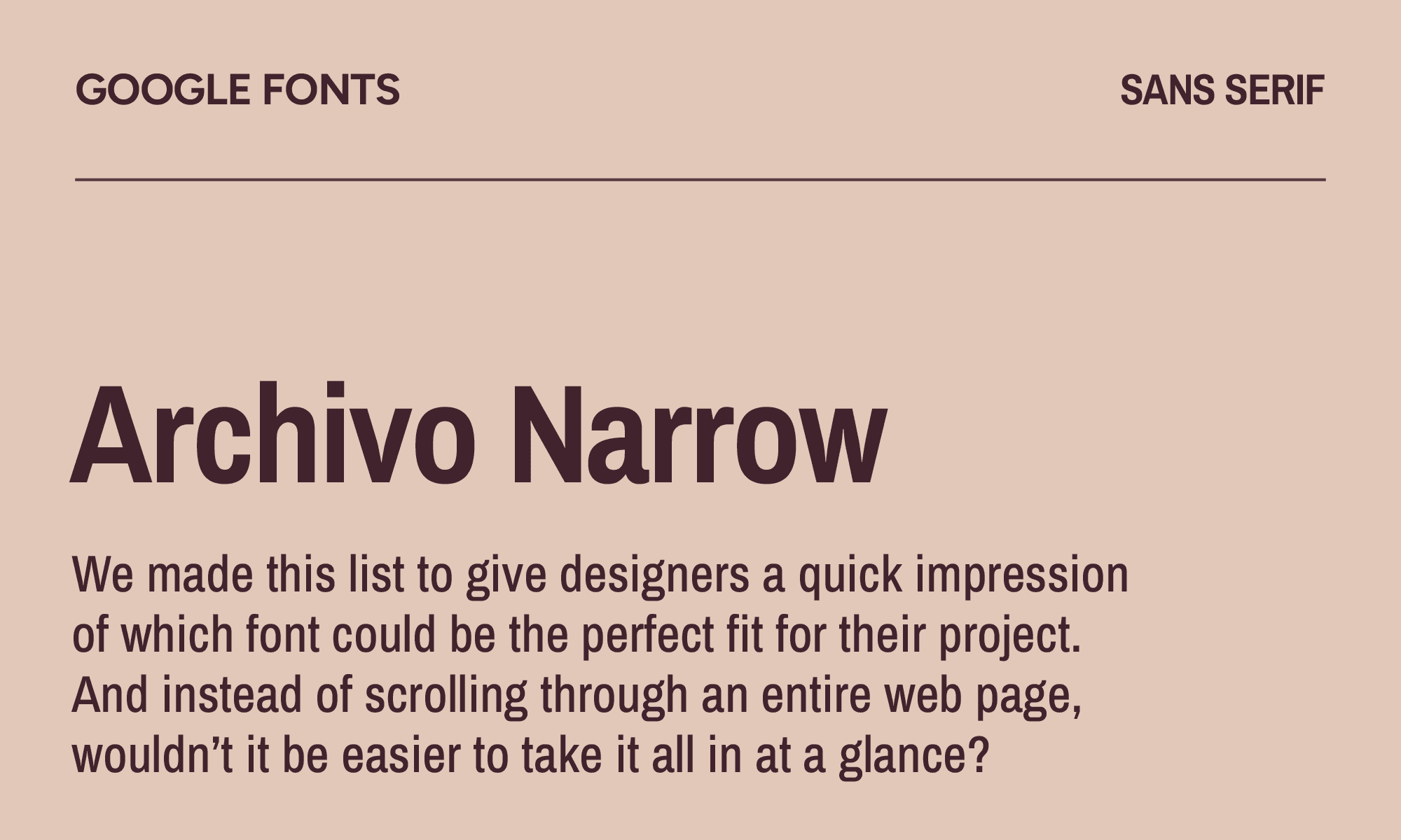
Archivo Narrow
| Classification | Sans serif |
|---|---|
| Designer | Omnibus-Type |
| Styles | 8 |
| Link | Download Archivo Narrow |
Archivo Narrow was designed for versatility, meaning you can use it in both print and digital platforms. While this grotesque sans serif typeface was meant to be used in highlights and headlines, you can also comfortably use this condensed font with compact UI elements, mobile interfaces, and navigation systems where horizontal space is limited.
On the whole, it’s more neutral and professional in formal contexts than a font like Cabin Condensed, which can read a little rounded for serious applications.
TikTok Sans
| Classification | Sans serif |
|---|---|
| Designer | Grilli Type |
| Styles | 7 |
| Link | TikTok Sans on Google Fonts |
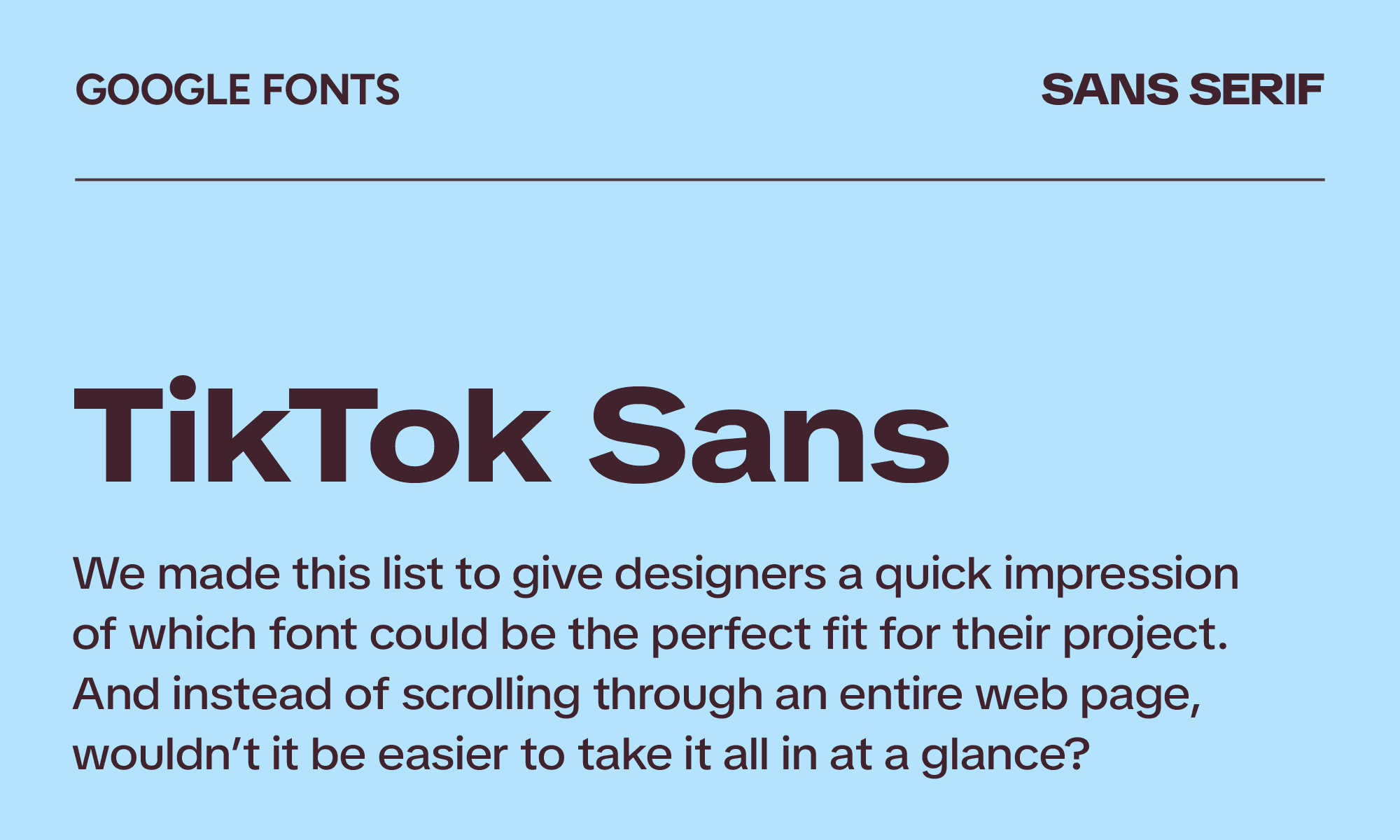
As the star of millions of TikTok videos, TikTok Sans is highly recognizable, meaning you won’t want to use it for branding. However, if you want to play up that TikTok association, it can be good for use in consumer-facing digital products, social media brands, and content creator tools.
Design-wise, the letterforms have more energy and a stronger sense of motion than something like Nunito or Outfit.
Merriweather
| Classification | Serif |
|---|---|
| Designer | Sorkin Type |
| Styles | 14 |
| Link | Download Merriweather |
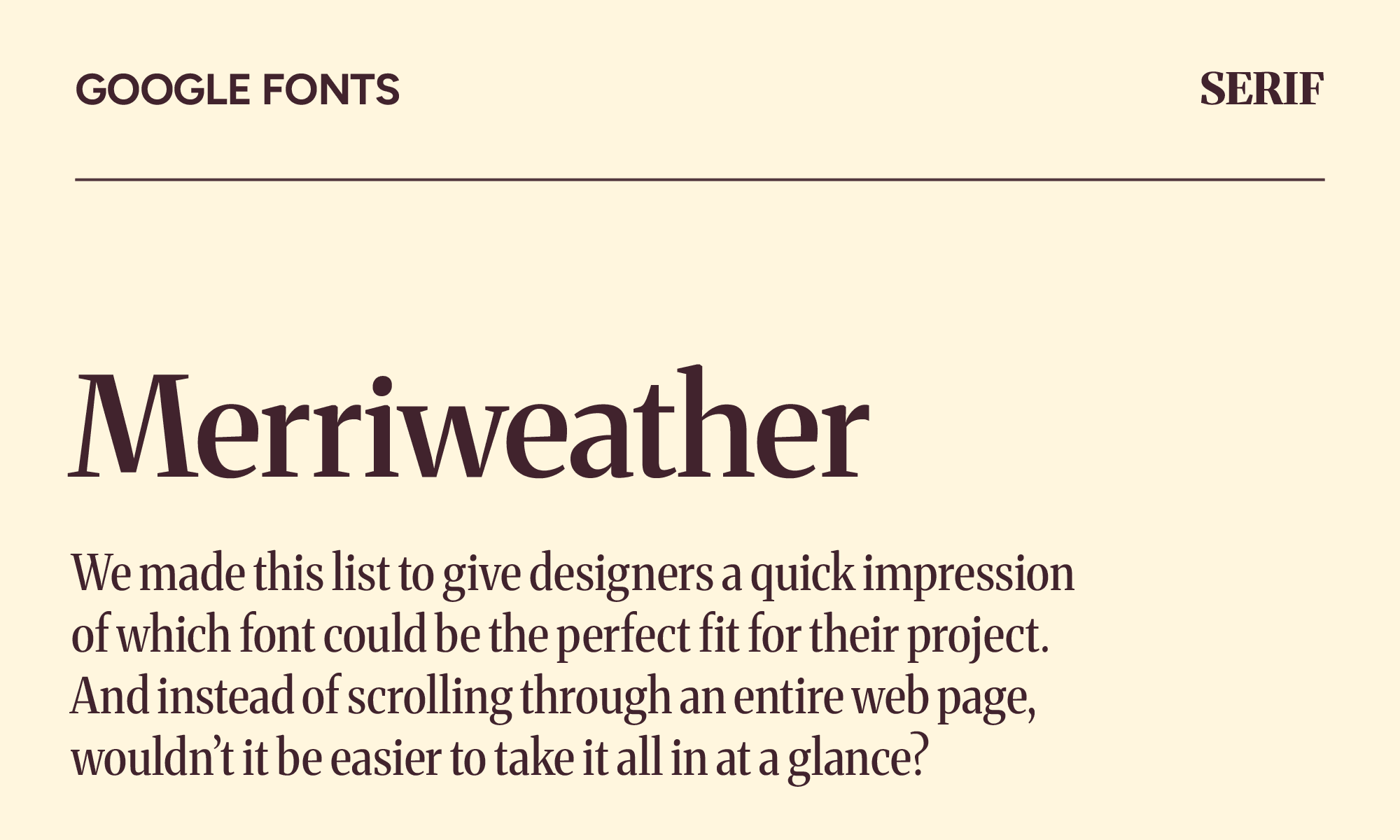
As far as serif fonts go, Merriweather is a classic. It's screen-optimized, legible, with more contemporary proportions and better weight variety than Georgia. For blogs, news sites, and long-form content platforms, it reliably delivers.
However, Newsreader does the same job more elegantly, and Eczar does it with more character. Merriweather is the dependable choice. Just know there are better ones.
Fira Sans
| Classification | Sans serif |
|---|---|
| Designer | Carrois Apostrophe |
| Styles | 18 |
| Link | Download Fira Sans |
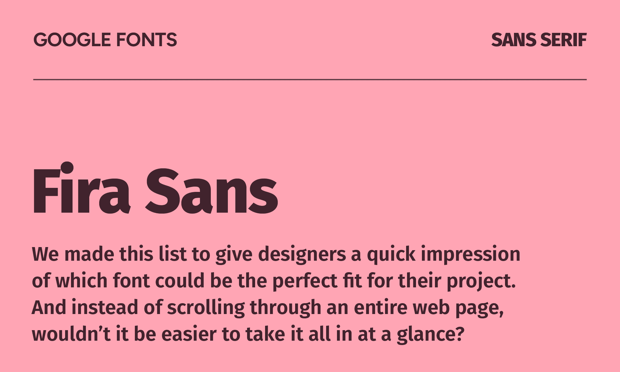
If you’re a Mozilla Firefox user, you probably recognize Fira Sans. It's an especially strong choice for technical products that want to feel slightly less corporate than IBM Plex but more serious than Outfit.
Because it stays legible over a large range of handsets and screen qualities, it would shine for developer tools, technical documentation, and any context that needs a humanist sans that reads clearly at small sizes.
Open Sans
| Classification | Sans serif |
|---|---|
| Designer | Steve Matteson |
| Styles | 12 |
| Link | Download Open Sans |
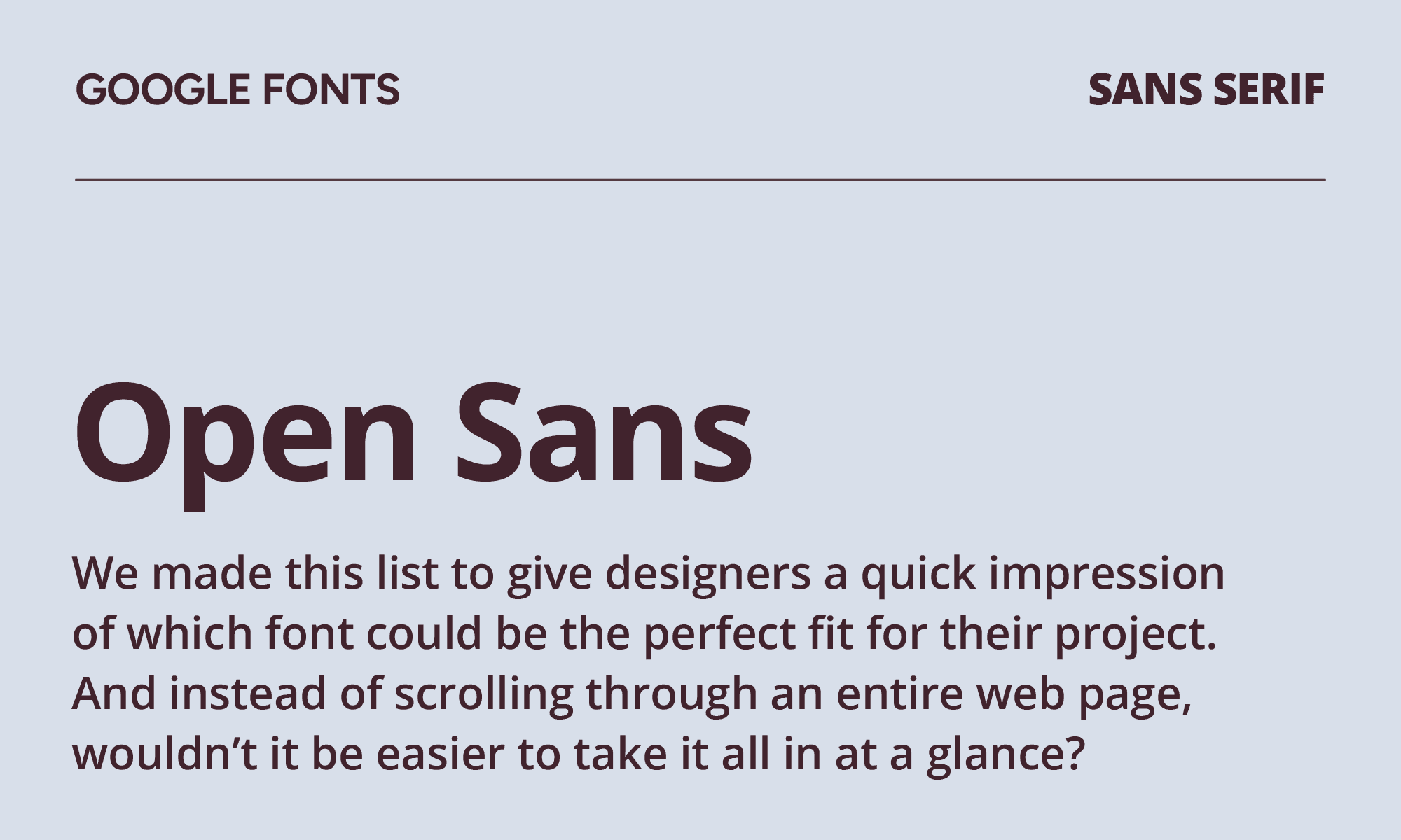
Open Sans’ use of open forms and upright stress lends to its friendly and neutral appearance. It works well across mobile, web, and print interfaces and stays legible at nearly any size.
For content-heavy websites, accessibility-focused design, and corporate intranets, it delivers, as it was built for screen rendering in a way that similar fonts like Helvetica were not. That said, it’s highly used across the web, so you certainly won’t stand out with Open Sans.
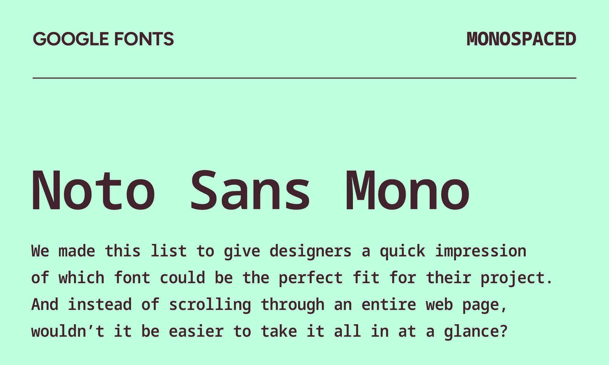
Noto Sans Mono
| Classification | Monospaced |
|---|---|
| Designer | |
| Styles | 9 |
| Link | Download Noto Sans Mono |
The Noto project's ambition is to have a font for every script in Unicode, and Noto Sans Mono brings that to monospace contexts. If you're building anything truly multilingual and working across Arabic, Chinese, Japanese, Korean, and Latin simultaneously, Noto Sans Mono is a responsible choice.
It’s most similar to Roboto Mono, but with more coverage outside of Latin scripts. It does the same utilitarian monospace job with a neutral vibe for all tech projects.
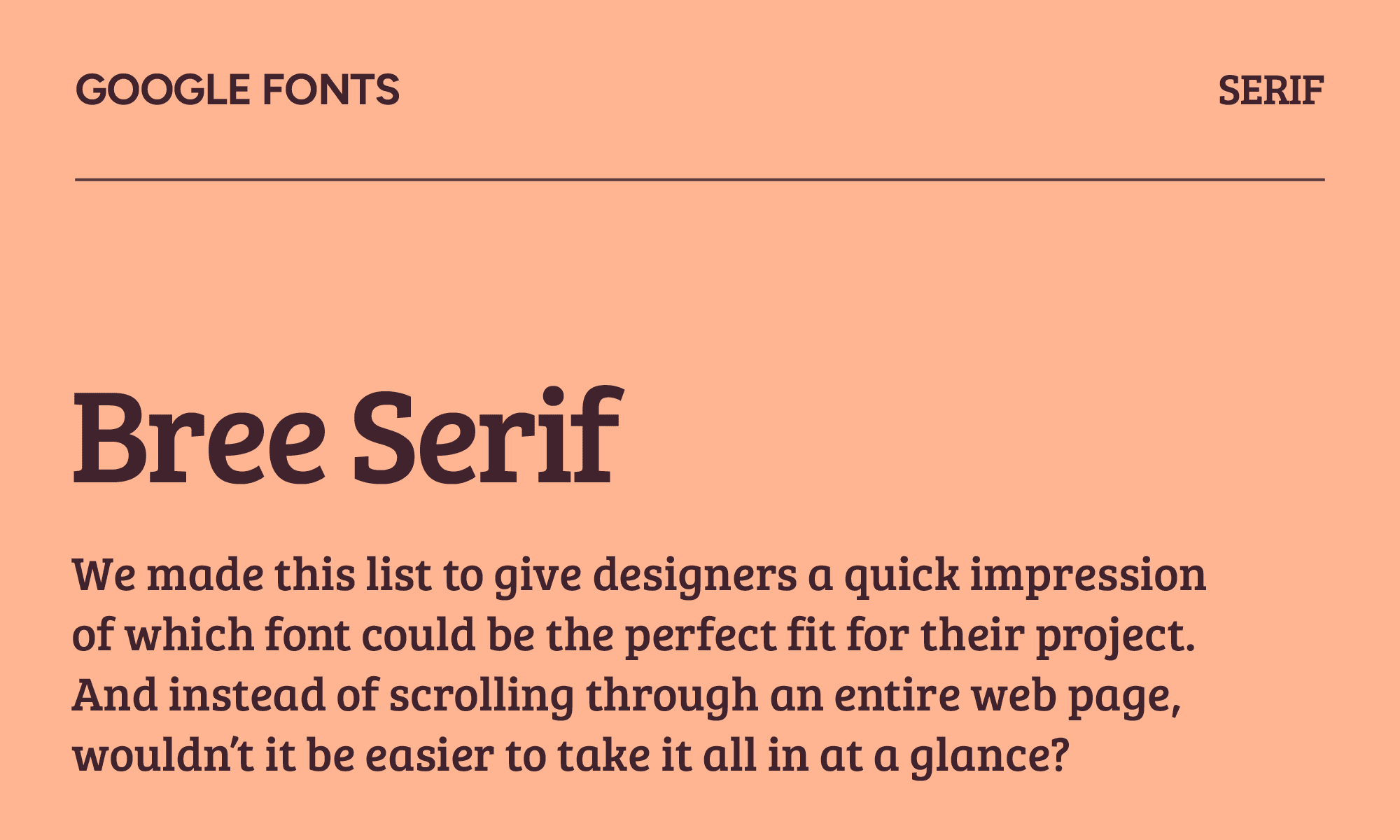
Bree Serif
| Classification | Serif |
|---|---|
| Designer | TypeTogether |
| Styles | 1 |
| Link | Download Bree Serif |
If you love Bree but are looking for a serif version, Bree Serif is your go-to. It has a unique charm thanks to its upright italic forms, angled crossbars, and slightly handwritten quality. Only one style means it's headline-only, but what a headline. It's been somewhat underused since its moment in the early 2010s and is due for a comeback.
Use Bree Serif for projects you want to feel approachable rather than formal, like educational content, children's publishing, and healthcare brands.
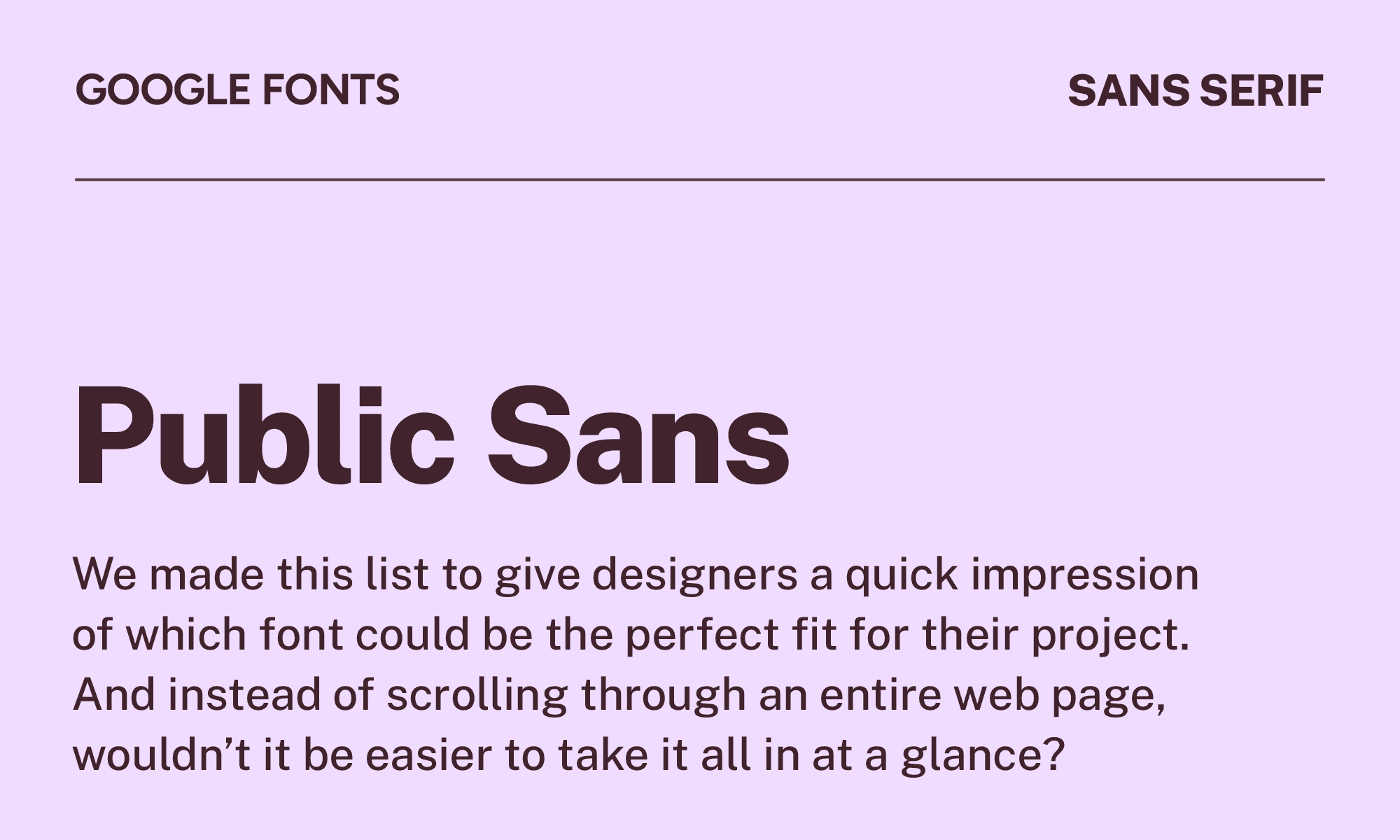
Public Sans
| Classification | Sans serif |
|---|---|
| Designer | USWDS |
| Styles | 18 |
| Link | Download Public Sans |
When you need to keep things calm and neutral, Public Sans can help. It was based on Libre Franklin and intended for use in headings, text, and interfaces.
For government websites, civic tech, and public-facing institutions, the most honest typographic choice is often one that stays completely out of the way. Public Sans does that better than almost anything else. It’s similar to Source Sans Pro, but more neutral and accessible for government applications.
Stop scrolling Google Fonts, start designing
You have 50 of the best Google Fonts at your disposal, so now's the time. Narrow down your favorites and let your creativity flow. No matter what type of project you're working on, you're bound to find the exact fit you need.
Still not sure? Browse our font ideas for inspiration, see which classics made our list of the most popular fonts in graphic design, or test and download your frontrunners with our Google Fonts preview tool.
And remember, fonts take on a whole new character in print. If your next project is a card, start with the best fonts for business cards, then see what great type looks like in the wild with these inspiring typographic business cards. Looking beyond Google's library? Our guide to the best free fonts has you covered.